
Here’s What the New iOS 14 Home Screen Might Look Like
 iSpazio
Toggle Dark Mode
This week we saw a few significant leaks revealing what will be coming in iOS 14, including a revamped mouse UI for iPadOS, overhauled multitasking and several new Apple Watch features, all of which suggests it will be an exciting year for iOS updates.
One of the biggest changes that came to light this week, however is a new home screen view. This would mark the first time in, well, pretty much ever that Apple has made a significant change to the layout of the iOS home screen, especially on the iPhone.
Although iPadOS gained the ability last year to set the icon density and add the today widgets in landscape view, it still retained the standard grid layout that’s been used since the first iPhone came out in 2007. The design has otherwise evolved only iteratively over the years, adding the ability to reorganize the icons and even drop them into folders.
With iOS 14, however, it looks like Apple is working on an entirely new list view for the home screen. It’s hard to say right now whether this is going to be an alternate overall layout like it is on the Apple Watch or simply an additional page that users will be able to swipe to, but what we do know is that it will let you see a full list of your applications and sort and filter them not only alphabetically but also by unread notifications, last opened, and more.
What This Could Look Like
9to5Mac reader Parker Ortolani has created some concept mockups based on 9to5Mac’s original reporting, providing some interesting ideas about the new design and how useful this new view could actually turn out to be.
In Ortolani’s concept, the new screen includes a Spotlight search bar at the top with a segmented control below it to let the user switch between an alphabetical list of all of the apps installed on their iPhone, a list of apps sorted by most recently used, and a list that only includes apps with red dots — notifications that require attention.
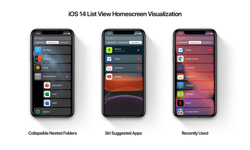
The concept also imagines how folders could be represented in the view, shown hierarchically with a standard control to collapse or expand their content. From what we know so far, however, it’s unclear whether folders will be included or whether the apps will simply be presented as a static list.
9to5Mac also previously reported that Siri suggestions would factor into the new list view, expanding on how the swipe-down Spotlight view currently shows recommended apps. For example, a Workout app could be recommended based on the user’s current location and the time of day.
Another set of mockups by iSpazio shows a variation that’s a bit more akin to how the Apple Watch handles list view, which would allow users to permanently switch between the familiar grid view and a list view, in this case via a permanent mode toggle at the top of the screen. iSpazio’s concept also imagines adding summary descriptions to each item in the list, such as displaying the number of unread messages under the Messages app or the next calendar event under the Calendar app.
Of course, as interesting as both of these concepts are, they remain just concepts based on code that’s been found in early iOS 14 betas. Not only might Apple’s final list view look different, but there’s not yet any guarantee that it’s coming at all. Either way, however, we should know in a couple of months, since Apple is still expected to unveil iOS 14 at WWDC 2020 this year, which will be held online due to concerns surrounding the novel coronavirus pandemic.
[The information provided in this article has NOT been confirmed by Apple and may be speculation. Provided details may not be factual. Take all rumors, tech or otherwise, with a grain of salt.]


