Apple Music Classical Drops the Red for a Sheet-Music Monochrome Look
Toggle Dark Mode
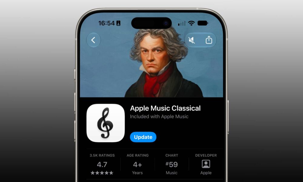
In case there was any doubt that the rather bland new Apple Music icon in iOS 27.2 wasn’t a permanent fixture, Apple has just made the rebranding abundantly clear by now extending it to Apple Music Classical.
For those who may not have encountered it yet, Apple Music Classical launched in early 2023 as a dedicated platform for classical music enthusiasts. While it promises access to the world’s largest digital catalog of classical music, it’s really just a different lens through which to view the Apple Music library, organizing tracks by movements, orchestras, conductors, soloists, and instruments alongside composer biographies and editorially curated selections. Since it accesses the same library, it’s available to all Apple Music subscribers at no additional charge.

The new icon popped up last month in a late iOS 27.2 beta, a few days before Apple announced a new brand identity for Apple Music. While it’s still not clear precisely how the monochromatic icons fit in with a design that seems more inspired by acoustic and liquid dynamics, it’s clear Apple is leaning into a sense of minimalism here.
To be fair, the redesigned icon style feels like a better fit for Apple Music Classical, with a black treble clef on a white background being more reminiscent of looking at a piece of sheet music. The beamed eighth notes of the standard Apple Music icon could be seen the same way, but that feels less obvious.
Apple hasn’t said much about the rebranding beyond the announcement it made two weeks ago, which focused more on the acoustic liquid rig and new wordmark than the Home Screen iconography.
However, upon reflection, Apple may have simply been looking for a color scheme that would set Apple Music apart in a sea of popular rival streaming services that have leaned hard into red shades and gradients, such as YouTube Music, Netflix, and ESPN, not to mention several major news apps, like CNN, BBC News, and CBC News.
Apple’s departure from red goes beyond the icon, as it’s also swapped out the traditional red accents inside the app for more subtle blues. While it’s still an adjustment, it seems like a far less controversial design change, as it helps album artwork stand out more by letting the Music app’s UI fade into the background.
The Apple Music Classical 4.1 update only lists “stability and performance enhancements” in the release notes, so the sense is that Apple pushed this one out primarily to match the rebranding. A few minutes of poking around the app doesn’t reveal any other obvious changes.
Apple Music Classical remains the best way to find and enjoy classical music due to its tight focus on that broad genre. While it initially launched solely for the iPhone, Apple has since released an Android version and brought the app to the iPad, CarPlay, and even the web, although it still lacks a native Mac version. Playlists created in the Classical app can be accessed from the primary Apple Music app, but Mac users who want to dive deeper will need to rely on the web, as Apple doesn’t allow the iPad version to run on the Mac.