
How Apple Is Fixing Liquid Glass in iOS 27 and macOS Golden Gate

Toggle Dark Mode
Last year, Apple debuted Liquid Glass, its new translucent design language, to a less-than-enthusiastic reception. While the new design came to the entire OS 26 software lineup, Mac users were particularly ticked off about the new feature.
Numerous complaints appeared on Reddit and other social media channels, with some users going so far as to say they wouldn’t update to macOS 26, partially because of Liquid Glass. Even long-time Mac fans who were initially optimistic about the new design came to loathe many of Apple’s UI changes once the dust had settled.
The good news is that Apple apparently heard those complaints — and listened — because it unveiled what will likely be welcome changes in Liquid Glass in iOS 27 and macOS 27 Golden Gate.
What’s Changed in iOS 27
iOS 27 brings a new Liquid Glass slider that allows users to customize the transparency level, with the aim of making content and controls more readable. Plus, the Liquid Glass icons boast a sharper, more defined look. Menus, buttons, and other on-screen components gain added depth through new refraction features, while the Home Screen now supports extra-large widgets.
All of these changes seem to be an effort by Apple to address the complaints of the original Liquid Glass changes from last year.
The iOS 27 update offers fine tuning of how the Liquid Glass design language handles content and the iOS interface. Apple has added a darkened edge around Liquid Glass elements, along with brighter specular highlights. Readability has been improved throughout the entire system, adding greater depth and visual separation.
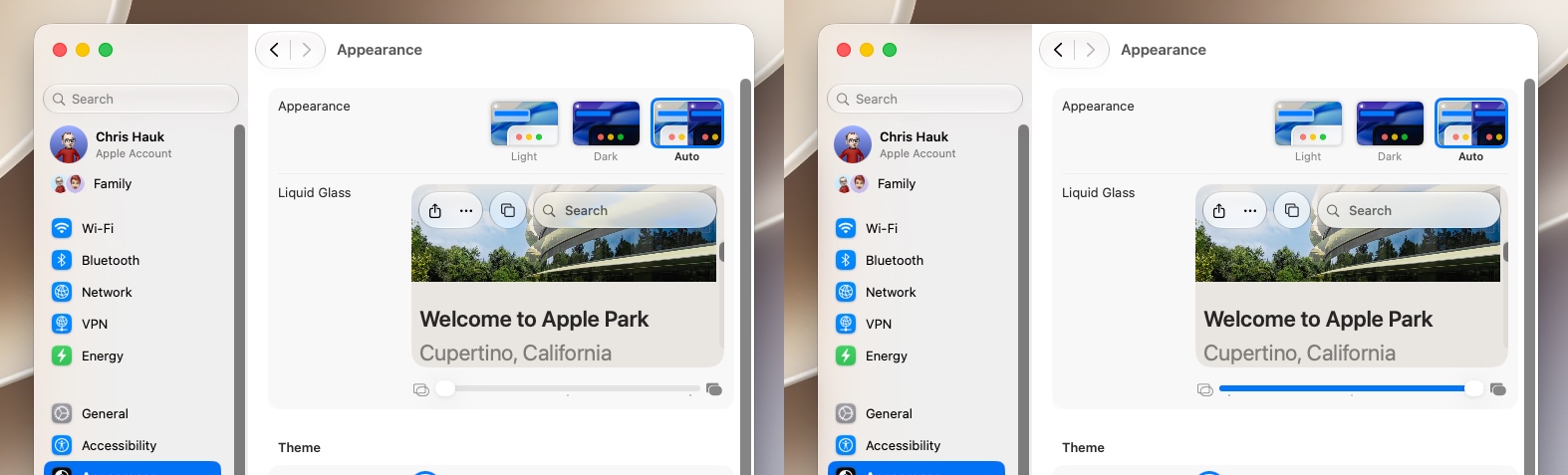
Perhaps the most important change to address complaints is the new Transparency control in the Settings app. By going to Settings > Appearance > Liquid Glass, you’ll find a slider that lets you adjust the feature from close to transparent to nearly opaque, as seen in the video below from our friends at Mactrast. This gives granular control of the Liquid Glass effect across the entire system.
Developers will be glad to know that their apps will also automatically take advantage of these changes when running on iOS 27, with no need for code changes or recompiling.
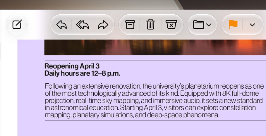
When content scrolls under floating bars in apps, a uniform toolbar keeps text legible while improving contrast. The effect is automatically applied for standard toolbars, and developers can further adjust it when using scroll edge effect APIs.
Apple has updated its Icon Composer tool to allow developers to build icons from multiple layers of Liquid Glass. Developers can also take advantage of new annotation features to add refraction or fine tune content effects.

What’s Changed in macOS 27 Golden Gate
As mentioned above, Mac users were the most vocal in their criticism of Liquid Glass, and Apple has responded by making changes in how the translucent design language is handled in macOS 27.
Transparency
Just like iOS 27, Apple has added a new Liquid Glass slider to macOS 27, giving users granular control over transparency levels across the operating system. This improves the readability of content and controls, while adding greater depth and visual separation.
As in iOS 27, developers’ apps will automatically take advantage of these improvements when running on macOS 27, with no need for code changes or recompiling. Liquid Glass also adapts to accessibility settings such as Reduce Transparency and Increase Contrast.
These system-wide enhancements extend directly to third-party macOS apps as well.
Additionally, macOS and iPadOS developers gain access to an API to surface icons for key app actions in menus, which are hidden by default.
Apple says a darkened edge and brighter specular highlights establish more depth and separation for the UI.
Toolbars and Windows
Apps now sport uniform toolbars, making text headings and control groups more legible. Windows now all have the same corner radius for more consistency between apps, and window corners in Golden Gate feature a noticeably tighter radius compared to Tahoe.
Active windows are more discernible, thanks to the opacity changes, changes to window shadows, and the windows’ sidebar design.
Sidebars
Sidebars are edge-to-edge, making the design less distracting and more uniform than last year’s floating sidebars, with no unnecessary shadowing. Icons in the sidebar are once again colorful, restoring what was taken away in Tahoe.
Icons
Mac icons are still “squirclely,” but the icon designs now boast more layers of Liquid Glass, improving detail and sharpness in all icon modes.
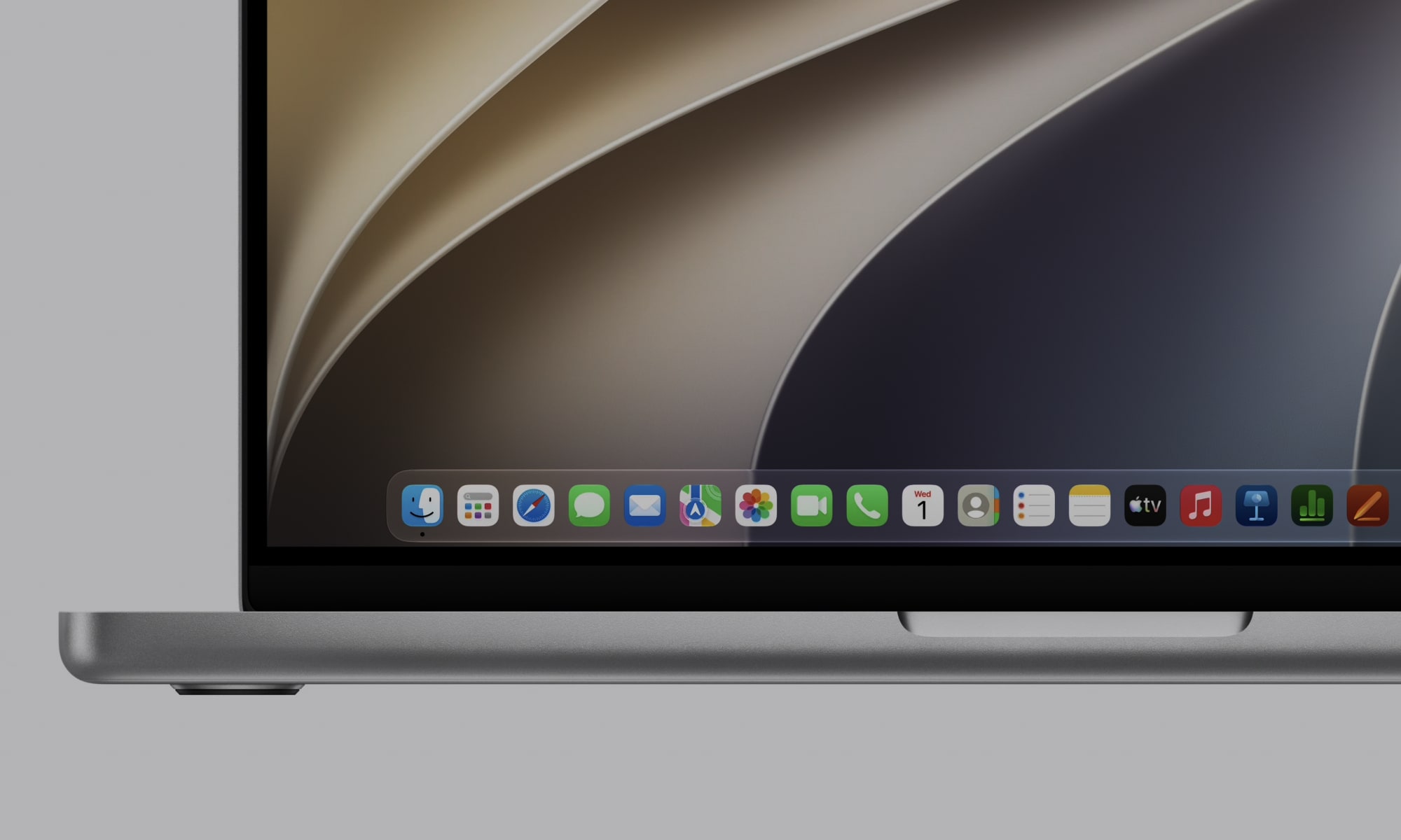
Icons are now used for some menu bar items, making it easier to find commonly used actions.
HDR
HDR is now used to provide more depth and dimension in the Golden Gate interface.
Availability
The first betas of iOS 27 and macOS 27 Golden Gate are currently available to developers for testing, and a public beta is scheduled for a July release. Both will likely see a wide public release in the early fall.


