Reviewers Give Us an Early Peek at Apple’s New Green iPhone 13 Lineup
 Apple
Apple
Toggle Dark Mode
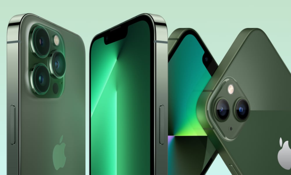
Although you’ll have to wait a week before you can actually see Apple’s new green colours for the iPhone 13 and iPhone 13 Pro in person, several reviewers are giving us an early peek at what the newest iPhone colours look like.
This might help you make up your mind if you’re thinking of preordering one of the new colours, although unless you’re on the fence between the iPhone 13 and iPhone 13 Pro, there’s not much of a choice to be made here. It’s unlikely anybody has been holding out for a green iPhone, and all the other colours have been available since last fall. Internally, nothing has changed; these are still the same iPhone 13 models that have already been available for months — it’s just now you can get them in green.
Nonetheless, the comparisons are interesting, and what’s also unusual is that green seems to be the trending colour for smartphones this season. Green was also Samsung’s colour-of-the-year for its new Galaxy S22 lineup, although it’s likely Apple’s choice to go green was more of a coincidence than anything else.
Over at Engadget, Cherlynn Low offers up one of the best looks at the two new colours, with several photos comparing the green iPhone 13 and the “Alpine Green” iPhone 13 Pro side-by-side.
It’s also notable that this is not only the first time that Apple has introduced a new colour for an iPhone Pro mid-cycle, but it’s also the first expansion of the “Pro” lineup beyond only one extra “premium” colour.
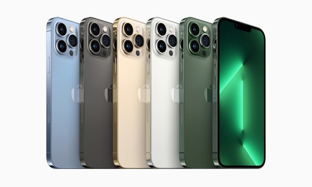
The iPhone 11 Pro got Midnight Green, the iPhone 12 Pro came in Pacific Blue, and the iPhone 13 Pro was originally just Sierra Blue. So, the addition of Alpine Green is even more interesting, and opens the door to the iPhone 14 Pro getting even more colourful later this year.
What’s also intriguing is that the iPhone 13 lineup represents a shift between where Apple has previously assigned its darker and lighter hues. Traditionally, the non-Pro iPhones got lighter and more “fun” pastel colours, while the more “serious” iPhone Pro models stayed with darker and seemingly classier finishes.
That changed last year with the Sierra Blue iPhone 13 Pro, which was clearly much lighter than what had come before, especially compared to the darker blue iPhone 13 and iPhone 13 mini. Starlight and pink were naturally brighter, of course, but that’s a given for colours like those.
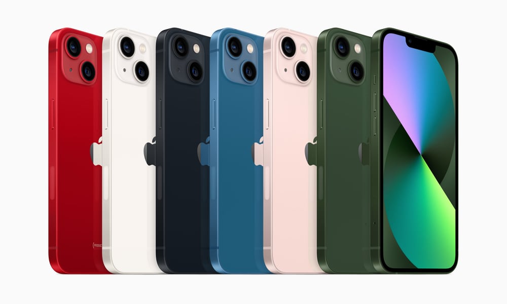
Now, with the new green iPhone 13 and iPhone 13 Pro, Apple has doubled-down on this colour shift. It’s the iPhone 13 that gets the darker green — Low calls it “earthier and closer to a leafy green” — while the “Alpine Green” of the iPhone 13 Pro is lighter, paler, and a bit more metallic. 
You could also be forgiven for thinking this is very close to the Midnight Green of the iPhone 11 Pro — it does look quite similar to our eyes. However, Britta O’Boyle over at Pocket Lint says she definitely still prefers that earlier colour, calling the new Alpine Green “not quite on par” with the iPhone 11 Pro’s Midnight Green.
Sadly, we haven’t found any comparative photos of the iPhone 11 Pro Midnight Green and iPhone 13 Pro Alpine Green just yet. However, it’s safe to say that if you were a fan of that colour on the iPhone 11 Pro, you probably won’t be disappointed by the Alpine Green iPhone 13 Pro. Certainly, it’s a nice return to green after two years of shades of blue.
Why Green?
Given the timing, The Verge’s Allison Johnson concedes that there’s a slim chance that Apple’s green could be an oblique nod to St. Patty’s day, but as Johnson points out, it’s “unlikely that Apple would time the release of a new phone color for what is more or less an unofficial binge drinking holiday in this country.”
While we can’t really comment on Samsung’s thinking behind its colour choices, when it comes to the iPhone 13, it’s probably fair to say that Apple simply wanted to introduce a new colour, and it didn’t really have many other options.
It’s worth noting that Apple’s never had a dark green entry-level iPhone. The closest we’ve gotten was the famous Midnight Green iPhone 11 Pro, and that’s been off the market for years. The greens used for the iPhone 11 and iPhone 12 learned more toward pastels.
In fact, the green iPhone 11 was light enough, but with the iPhone 12 Apple made it even more pale, moving toward what was more of a mint green hue.
When the iPhone 13 lineup came along last fall, Apple skipped green entirely. Instead, Apple gave us pink and blue as the “extra” colours beyond the standard black (now “Midnight”), white (now “Starlight”) and (PRODUCT)RED options.
So, in looking for a new iPhone 13 colour, Apple’s options were basically green, yellow, or purple. It did purple last spring with the mid-year iPhone 12 release, so it wasn’t about to repeat itself there. This left yellow, orange, and green, and if Apple wanted to go darker — which it obviously did — green was the obvious choice.
A darker yellow would have been more like an orange. Rumours that Apple was working on a bronze/gold/orange colour for the iPhone 13 Pro last year didn’t come to fruition, and there’s never been an orange iPhone.
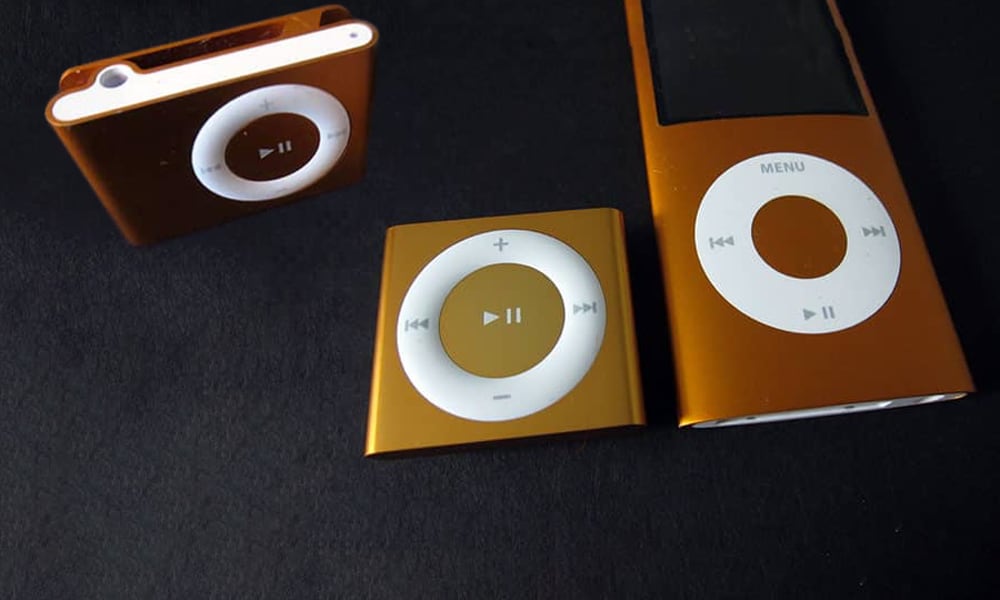
In fact, Apple hasn’t used any shade of orange since the days of the 2010-era iPod shuffle and iPod nano — and it consciously discontinued the orange version when it refreshed the colours of the fourth-gen iPod shuffle in 2012.
We get the feeling somebody at Apple isn’t a big fan of orange, but it’s also fair to say that it’s a colour that’s very hard to get right. The orange iPod shuffle had more of a dull copper hue that looked uninspired next to the more vibrant pink and green options.


