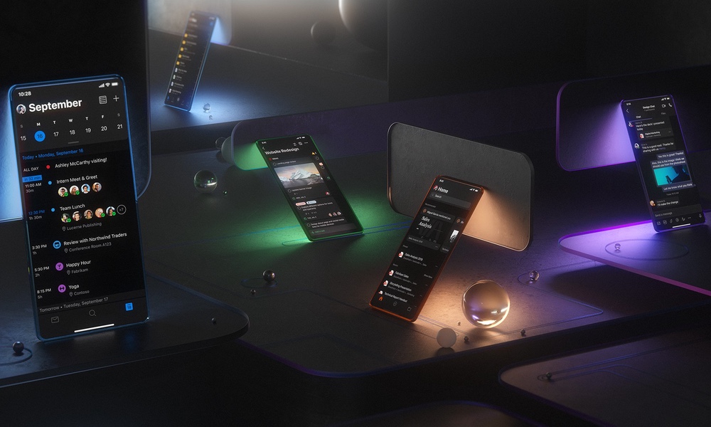
Microsoft Embraces Its Dark Side for iOS 13
 Credit: Microsoft
Toggle Dark Mode
One of the most visible new features when iOS 13 lands next month will be its new dark mode — a feature that we’ve all been waiting for since we first saw hints of it being hidden back in iOS 10. It’s taken three more years before Apple felt it was ready for prime time, but it’s finally almost here.
While all of Apple’s built-in apps will support it, of course, third-party developers will still have to do their own work to offer the new dark mode properly in their own apps, and it looks like one of the giants of productivity apps, Microsoft, is jumping into the dark side experience wholeheartedly in order to have its apps ready to go with a gorgeous Dark Mode experience when iOS 13 arrives.
In a blog post on Medium, Jon Friedman, Microsoft’s VP of Design & Research, provides an in-depth view of how Microsoft isn’t just flipping a switch to put white text on a black background but is in fact crafting a whole new experience for users who prefer to live on the edge of night.
People often think of Dark Mode as a choice between a black or white screen, but this feature involves a wide spectrum of both grayscale and color gradients.
Darker themes aren’t new to Microsoft, of course — the company first introduced them several years in Office 2010 on the desktop, but the iOS versions of its apps have been left out of most of the theming experience that’s available on its flagship Windows platform.
This week, however, Microsoft has not only announced its intention to embrace dark mode in iOS 13, but has already updated the first of its apps to support it in the form of Outlook for iOS. Friedman promises that with the release of iOS 13, this rollout will be extended to the entire Office 365 suite, including Word, Excel, OneNote, PowerPoint, SharePoint, OneDrive, Planner, and even its new To-Do app.
To illustrate the attention to detail that Microsoft put into crafting a darker theme for its iOS apps, the company actually released an impressive video highlighting the new design, and Friedman explains how it’s so much more than just another coat of paint, with the teams actually conducting research to focus on areas where users are likely to want to use Dark Mode, and adopting a “comfortable, crisp, clear, and aesthetically pleasing” design that it felt was more appropriate to professional productivity rather than the brighter and more “neon” experiences that some designers have gone for.
Leading the Way
The effort that Microsoft has put into designing its apps for iOS 13’s Dark Mode should hopefully serve as an example for what good developers should be looking to accomplish. It’s going to be far too easy for some to simply invert the colors in their apps and call that “Dark Mode” but both Apple and Microsoft have shown with their own apps that class will tell, and a successful dark mode app will need to embrace designs that are both appropriate for the type of app as well as the right balance and use of color for the various UI elements.
Apple has recently reminded developers to get ready for Dark Mode by taking advantage of the new iOS 13 APIs that will automatically enable it, and pointing to resources on how to optimize and test apps for Dark Mode. Apple also notes that it will be offering an “opt out” for those developers who need more time to get their apps ready, or simply feel that Dark Mode is not suited for their apps, as those developers who don’t opt out are still going to get some kind of Dark Mode presentation forced on them by iOS 13.


