Leaked Screenshots Show Samsung’s Minimalist Galaxy S8 UI
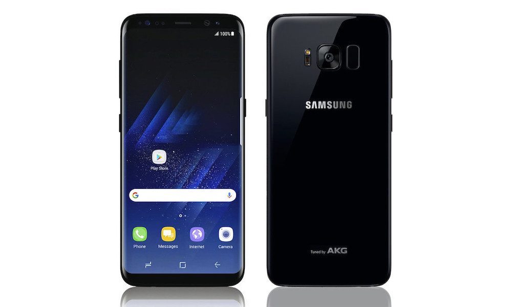
Image via Samsung, Benjamin Geskin
Toggle Dark Mode
While many would argue that Samsung’s recent Galaxy S flagships have trumped Apple’s iPhone in the hardware department, one area where the South Korean company continues to struggle to innovate beyond its Cupertino-based counterpart is in regards to the unrivaled speed, fluidity, and ease-of-use that iOS brings to the table.
Indeed, iOS is a true mobile-computing powerhouse — updated by Apple, constantly, incorporating new features and stability enhancements. Whereas, in contrast, Samsung’s Galaxy S devices run Android, generally in its most recent incarnation, albeit overlaid by the company’s proprietary TouchWiz UI so as to enhance the bare-bones Google experience.
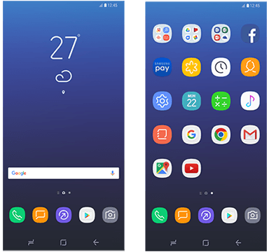
Well, the forthcoming Galaxy S8 and S8+ handsets are no exception to that long-standing rule. Screenshots showing Sammy’s refined TouchWiz UI were recently published by SAMMobile, which appear to give Galaxy-fanatics the faintest signs of what they should expect this year.
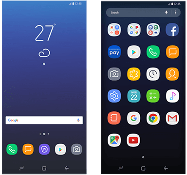
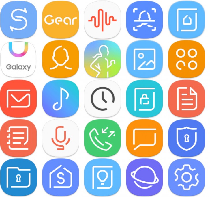
Of course, while Android devices are highly-customizable, and can often be outfitted with a myriad of 3rd party skins, interfaces, and ROMs, Samsung nevertheless appears to have incorporated more minimalist software elements — particularly, as you can see, when it comes to app icons. They look rather basic, featuring a variety of vibrant colors, penciled in with white insignias to represent each app, respectively.
In one set of images, we can see the device’s standard home screen, adorned in what appears to be Phone, Messaging, Internet, Google Play Store, and Camera app icons, with the Android OS navigation and app launcher buttons right below them. The other image appears to show the device’s app launcher, itself, encompassed by a myriad of app icons — from Facebook to Google Maps, Music, Chrome, Gmail, utilities, and many more.
Interestingly, not all of the app icons are reminiscent of Samsung’s new minimalist design hues. While we can clearly see that 3rd party apps — and even those created by Google — depict the app, itself, all of the icons appear to follow the same fundamental design, boasting well-rounded, almost circular edges.
Keep in mind; if you’re planning on picking up a Galaxy S8 or S8+, you’ll more than likely end up choosing a different skin or UI, anyways. There are hundreds — if not thousands — of options available when it comes to customizing Android-powered devices, even though these customizations sometimes come at the expense of performance. Still, it’s nice to see that Samsung is at least trying to make something different — though whether it’s well received or not, only time will tell.
The company will be unveiling its S8 and S8+ devices at a special media event on March 29th, with both models going on sale roughly a month later on April 28th.
Do you like Samsung’s new ‘minimalist’ design theme? Let us know in the comments!

