
Chinese Designer Says iOS 11’s UI Contains ‘Many Inconsistencies’

Toggle Dark Mode
Apple has a well-documented history of striving for excellence in design and innovation, stemming from the days when Steve Jobs roamed the halls of his empire at 1 Infinite Loop, applying his perfectionist philosophy to every product in his company’s portfolio. Historically, it was Steve’s unquenchable drive to deliver 110% that has always been at the core of Apple’s software and hardware projects — and which Tim Cook has promised will always remain.
Of course, while Apple’s penchant for working out the kinks is unmistakeable and, not to mention, much-appreciated by its customers, unfortunately the company’s launch of iOS 11 on Tuesday appears to be swarming with inconsistencies, making the build feel “unfinished,” in the words of one Shanghai, China-based designer.
Those sentiments come to us courtesy of a blog post published Tuesday to Hackernoon by user Ryan Lau. In his profile, Lau describes himself as “a designer and typography enthusiast,” which suggests that he may have at least some experience pin-pointing typographical errors. And ironically enough, while Lau points to a long list of grievances with Tuesday’s iOS 11 update, the issues he claims to have found are, for the most, typographical.
“The unfinished feeling in iOS 11 mostly comes from UI and animation,” Lau said, while adding that “UI elements in iOS are quite inconsistent, mixing a variety of UI elements, which might look quite similar but introduce a disconnected feeling for UX.”
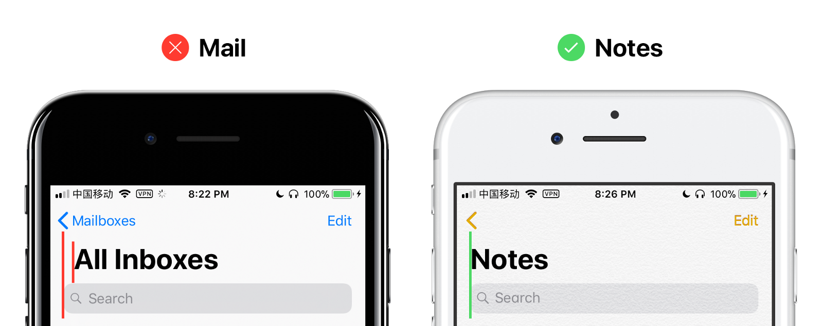
Specifically, he points to inconsistencies in certain UI elements that were updated for iOS 11 — such as larger font titles in menu lists and a new Search Bar, within which even the most insignificant errors appear to have been overlooked by Apple’s engineering team, Lau suggested..
“In my opinion, those newly introduced elements, which might be unfamiliar and new even to Apple engineers, have caused many inconsistent UI experiences in iOS 11,” he said.
Examples
Lau uses two of Apple’s stock iOS apps to illustrate his findings — Mail.app and Watch.app. In the case of the former, as mentioned above, Lau noted that the Mail UI contains new elements such as larger font titles and a new universal mailbox search bar, noting specifically that the new title in Mail has “extra left margin” compared to how it’s shown in Apple’s iOS design guide. “In design guide example, Large Title and Search Bar share same distance to the edge, but in Mail.app, Large Title clearly moves a bit right compared to Search Bar,” he said.
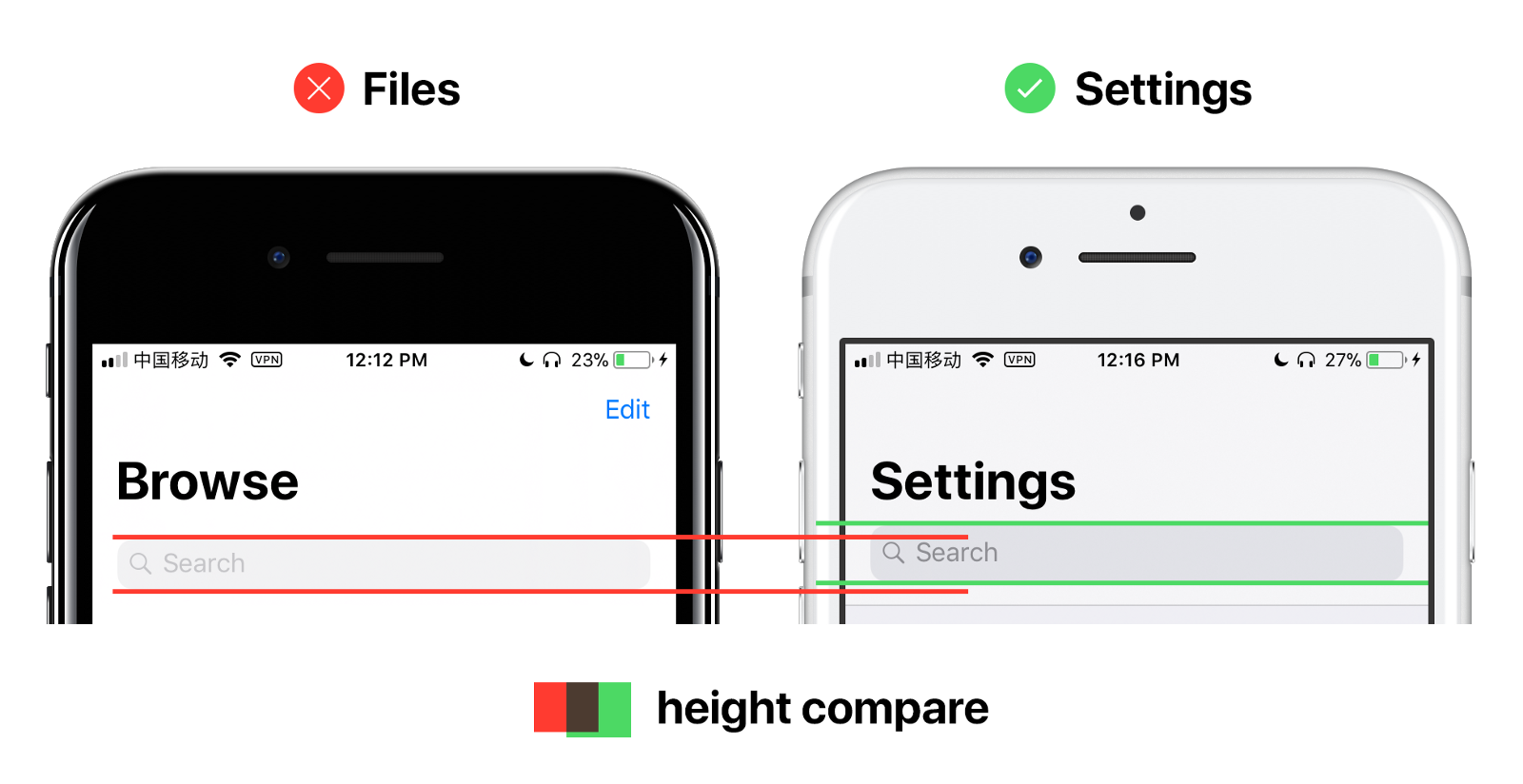
He goes on to thoroughly outline a lengthy list of similar issues that appear in other apps, such as Watch and Files containing Search Bars that are both smaller and inconsistent with Apple’s iOS design guidelines, as well as the fact that Apple appears to have used different font styles in Apple Music and the App Store apps.
Lau, whose post was roughly translated into English from Chinese, maintains that he didn’t go through all the trouble of pin-pointing these errors to bash Apple in any way; but rather, he merely wanted to hold the company to its own standards.
“Apple is still my only favorite and mostly respected company,” he said. “I sincerely wish that, while stepping forward, Apple could still maintain those values they’ve cherished and built in the past.”


