
Apple Walks Back Some Controversial Safari 15 Design Changes, Lets Users Choose Their Layout in Beta 6
 Jesse Hollington
This year’s release of iOS 15 promises to herald one of the biggest redesigns we’ve ever seen for Apple’s Safari browser, but if the pushback from developers and early adopters of the public betas are any indication, it’s a change that hasn’t been sitting well with many Apple fans.
There’s actually a lot changing in Safari 15, but perhaps the most controversial move for iPhone users has been Apple’s choice to shift the address bar down to the bottom of the screen, with a minimalist design that also combines several of the buttons into single unified controls.
Even when it’s for the better, change is hard, but in this case, there are some valid criticisms that Apple has actually made things worse in many ways by making the UI less intuitive and obscuring features that were previously easier for new users to find.
For instance, when the first beta of iOS 15 arrived, there wasn’t a refresh button anywhere to be found. Instead, users had to either use the same pull-down-to-refresh gesture that’s long been the standard in other apps like Mail, or find the Reload option on a very full menu of options hidden behind a single ellipsis button.
There were also a few other tricks, such as long-pressing on the address bar, that would reveal quick menu options, but these were the sort of things that were useful only if you knew about them — and Apple really wasn’t providing any obvious way for anybody to know that they were there in the first place.
To be fair, Apple has been tweaking the design over the course of the beta cycle, and even walking back some of these changes. For example, beta 3 moves the URL/search field above the keyboard rather than leaving it at the top of the screen, and added back the distinct Safari reload button beside the address bar, while also adding it to the aforementioned hidden Safari menu.
Apple also previously walked back one of the most controversial Safari design features on the iPad and Mac, allowing users to choose to switch from the much-despised “address-bar-in-a-tab” design introduced at WWDC back to a more normal distinct address bar.
Safari 15 Layout Options on iPhone
Now it looks like Apple is taking a page out of that book to allow iPhone users to return to a more comfortable Safari layout as well.
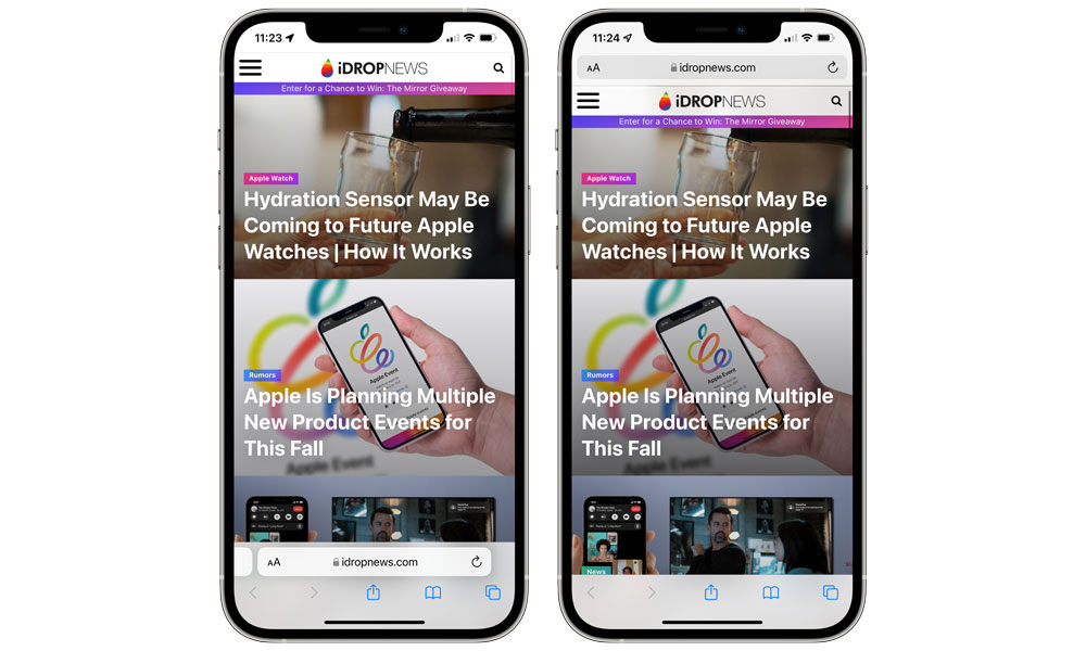
Thanks to a new set of Safari options in the sixth developer beta of iOS 15, Safari users will now be able to choose between the new “Tab Bar” which places everything at the bottom of the Safari window, or the more traditional “Single Tab” design.
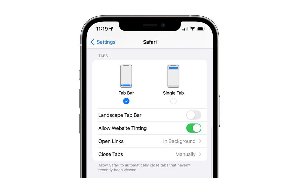
The latter option effectively makes Safari on iOS 15 look and feel almost exactly like it did in iOS 14. The address bar returns to the top of the screen, with distinct buttons for accessing Reader View, website options, and reloading pages, and the bottom bar reappears with its Back/Forward, Share, Bookmarks, and tab buttons.
Notably, this setting doesn’t affect Safari when you’re using your iPhone in landscape orientation, where it appears just like it did in iOS 14. A new “Landscape Tab Bar” setting will still allow you to choose whether you want to see individual tabs in landscape orientation or not, however.

There’s also a new Allow Website Tinting option that will let you choose if you want the page heading to match the header colour of the current website. This currently has no effect in Single Tab portrait view, but does affect the address bar and top controls in landscape orientation. We suspect Apple will tweak this further in future betas, however.


