Apple Execs Explain How Crafting the Apple Watch 7 Was a ‘Unique Challenge’
 Credit: Apple
Toggle Dark Mode
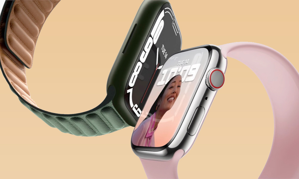
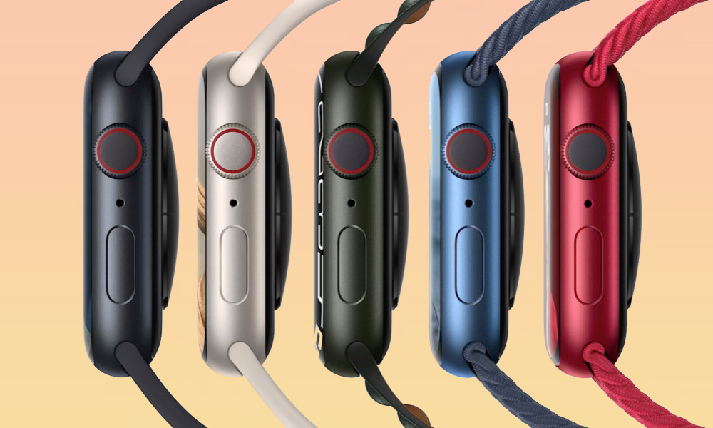
At first glance, the new Apple Watch Series 7 may not look like a major upgrade from last year’s Series 6. However, it would appear that increasing the screen by a seemingly scant couple of millimeters required a great deal more engineering and design effort than we’d ever have expected.
While a slew of rumours of a big new design for this year’s Apple Watch really set us up for disappointment this year, it’s also unfair to dismiss the Apple Watch Series 7 as lacking any innovation at all. The display technology in this year’s Apple Watch packs in some significant improvements to what we’ve seen in prior models.
Some found it comforting to think that maybe Apple just switched things up at the last minute after running into production problems. Still, the preponderance of evidence suggests that it was this new display that held things up and that this was the Apple Watch that we were destined to get all along.
There’s no shortage of innovation in the design of the new display on the new Series 7, and Apple has already touched on this by describing how it’s redesigned the geometry of the screen to improve durability and integrated the touch sensor into the OLED display panel to reduce the thickness and the borders.
This really doesn’t sound like something that Apple threw together in three weeks, and now two of the company’s executives have offered some more insight into exactly what went into this new design.
In a recent interview with The Independent, Alan Dye, Apple’s Vice-President of Interface Design, and Stan Ng, Product Marketing VP, spoke with David Phelan to explain many of the thought processes and decisions behind this year’s Apple Watch Series 7. It turns out that designing and building a new Apple Watch isn’t as easy as it looks.
A ‘Unique Challenge’
More than any other product that Apple has ever made, the Apple Watch is a study of Apple’s adeptness at making tradeoffs. Here are just a few of the requirements that Dye and Ng described:
- It has to be small enough to fit comfortably on a user’s wrist.
- It has to sport a reasonably attractive and fashionable design that doesn’t look too “techie.”
- It has to pack in meaningful health and fitness sensors.
- It has to present as much information on the display as possible and do so in a readable manner.
- It needs to provide an intuitive user interface for entering text and other information.
- It has to provide all-day battery life.
- It must remain compatible with watch bands from prior models.
Apple makes it look easy since we only see the final product, but when you really think about it, achieving even half of those points above is a huge balancing act, much less addressing all of them.
The wrist has unique challenges, you can’t just slap a huge display on your wrist and assume that someone can wear it all day long, or wear it to any occasion, that’s not going to work.
Stan Ng, Apple VP of Product Marketing
As Dye explains, Apple’s main objective for this year’s Apple Watch was to increase the display size as much as possible to open up several new possibilities. This included a full onscreen QWERTY keyboard — a feature that’s unique to the Apple Watch Series 7 since prior models simply don’t have enough space to make it work properly. An extra couple millimeters of screen real estate really does make a big difference.
In fact, Dye notes that the team saw this as an opportunity to “optimize the design of the entire experience,” which meant not only adding the QWERTY keyboard but also “reconsidering and recrafting every element,” resulting in hundreds of small changes to the UI.
This small size really puts a constraint on what and how much information can be shown at any given time and there can’t be any wasted space.
Stan Ng, Apple VP of Product Marketing
What’s notable here is that Dye described this redesign process as occurring “over the past couple of years,” which really shows how far ahead Apple thinks when it comes to designing new products.
‘Every Single Pixel Counts’
When dealing with a device as small as the Apple Watch, attention to detail is the name of the game. However, unlike the iPhone and iPad, there’s a limit to how large you can make the screen, as every pixel you add risks increasing the size of the wearable, at risk of making it less appealing for customers to actually wear.
The re-engineered display on Series 7 is a major technical innovation. Growing the display is such a huge benefit to users, but only if it doesn’t compromise any other part of the experience, such as comfort or aesthetics or battery life or band compatibility.
Stan Ng, Apple VP of Product Marketing
The big tradeoff here was growing the size of the display while minimizing the amount of bulk that would be added to the Apple Watch. This required Apple to develop some truly innovative new designs, which also presented new engineering challenges.
As Ng explained, Apple had to completely re-engineer the display from scratch. It didn’t simply take last year’s display and make it bigger, but rather created an entirely new display from the ground up. This encompassed just about every aspect of the display’s design, from the front crystal down to the internals.
The result was that Apple was able to pack a 20% larger screen into a case that grew by only 1mm.
Most of this came from the outer bezels, which shrunk from 3mm on the Series 6 down to only 1.7mm on the Series 7. By integrating the touch sensor into the OLED panel, Apple was also able to avoid increasing the thickness of the Apple Watch.
Dye’s team was also meticulous in designing the user interface elements to work with the extra pixels, carefully designing the keyboard to make it as usable as possible on the small screen, and designing a whole new variable font for the Contour watch face.
The new typeface is actually a variable font and what that means in general is, instead of having a fixed set of weights for the fonts, like light, regular and bold available font has millions of options in between those, so a designer can fine-tune the appearance of the text reducing or increasing the weight, just a hair at a time.
Alan Dye, Apple VP of Interface Design
A ‘Foundation Principle of the Watch’
Apple also set out to ensure that it wouldn’t compromise what Dye calls a “foundation principle of the Watch” — the interchangeable watch bands. This meant that while the team was willing to go a bit bigger on the Apple Watch Series 7, there was still an important constraint as to exactly how large it could get.
I think everyone felt like we could go a bit larger in terms of the hardware, but we never wanted to compromise what is a foundation principle of the Watch which is the interchangeable strap system. It was quite a huge process to get those two goals to work in concert.
Alan Dye, Apple VP of Interface Design
When Apple moved from the 38/42mm designs of the Series 1–3 models to the 40/44mm Series 4, most of the size increase was on the height of the watch rather than the width. This allows it to retain compatibility with all prior watch bands. This year Apple has done the same with the Series 7, but it also appears that it’s getting closer to hitting a wall as to just how big the watch body can get.
Naturally, Ng and Dye didn’t tip their hand as to what could be coming to the Apple Watch next, but the interview does give us a pretty good look as to where Apple’s design priorities lie. At the same time, the big and bold new design that was rumoured this year is still up in the air.
The most popular theory is that it’s coming to the Apple Watch Series 8 next year. However, some have also suggested it could be a way to distinguish the Apple Watch SE, but as this year’s Apple Watch unveiling proved, it’s hard to know anything for certain until Apple actually takes the stage and shows it off.


