
WhatsApp Gets a More Fun and Modern Design
Toggle Dark Mode
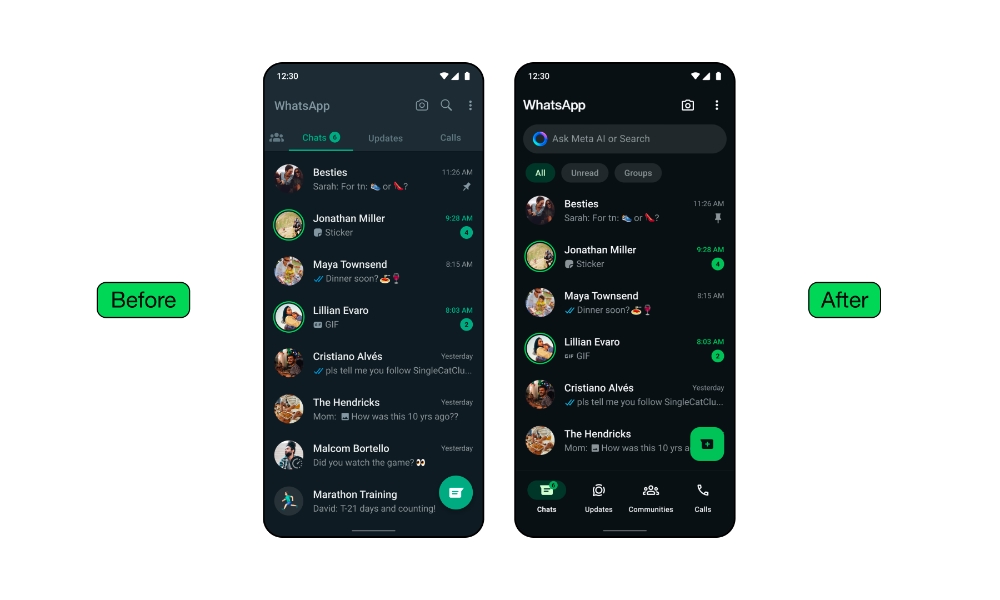
Meta’s popular WhatsApp messaging app is getting a fresh coat of paint. This week, the company began rolling out a refreshed design for its iOS and Android apps that changes up the color palette with a theme reminiscent of Facebook Messenger.
While the new design may seem less colorful at first glance, that’s actually because it makes much better use of color. A consistent green palette is now used throughout the app for buttons, accents, notifications, and more, which makes the whole experience feel more fluid, and neutral colors have been emphasized to deliver more contrast.

This is even more apparent in dark mode, where the contrast has been dialed up significantly. The background is now a proper true black that looks gorgeous on OLED screens, rather than the muted dark gray used before (and that sadly remains all too common in other apps’ implementations of dark mode).
We also heard that people wanted a darker dark mode. We focused on higher contrast and deeper tones to reduce eye strain in low-light environments. We’re making it one shade darker for improved visual appeal and legibility.Idit Yaniv, Head of WhatsApp Design
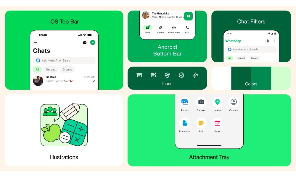
New iconography uses a more modern, rounded, and outlined style, while many illustrations are now animated for what Meta calls “a more playful aesthetic.”
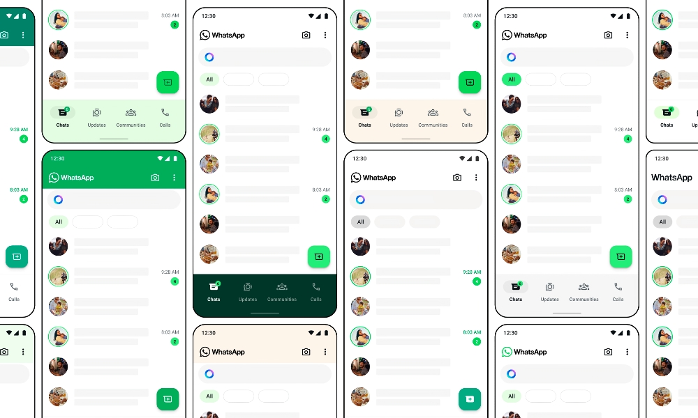
Meta is also adopting some iOS design principles in its Android app by moving the navigation bar to the bottom, where it’s more easily within reach of most people’s thumbs. While the iPhone app doesn’t get any stark layout changes like that, there is a new attachment tray that avoids taking up the whole screen when sending photos and videos.
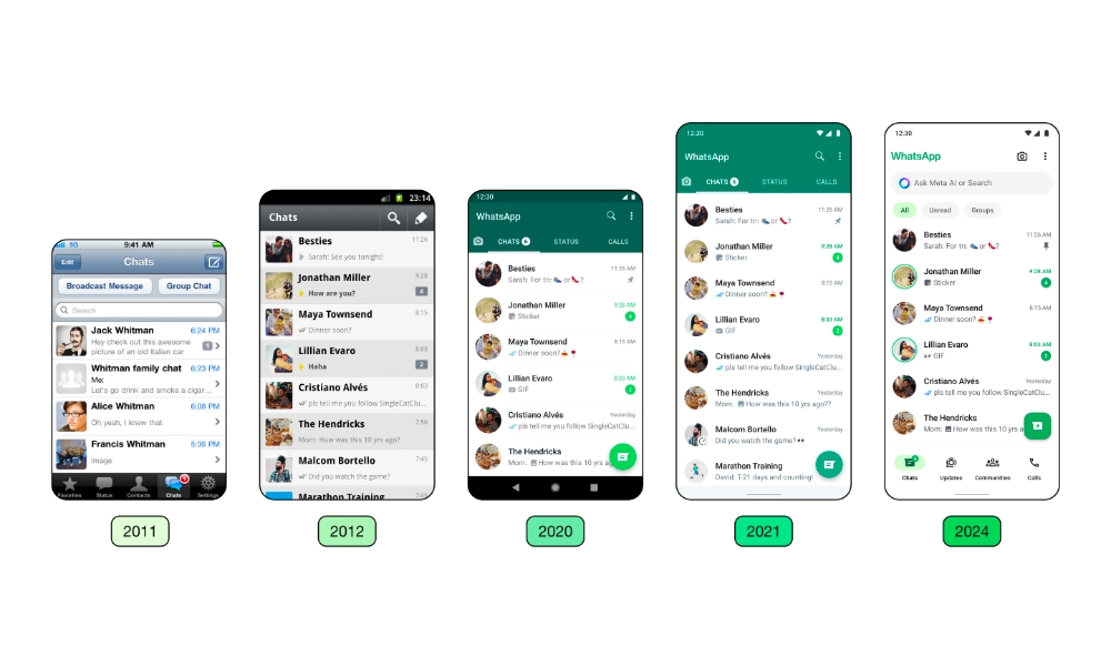
Idit Yaniv, Head of WhatsApp Design, went into more detail on these changes and the thinking behind them in the Design at Meta blog. She also provided a fascinating glimpse into how much the iPhone app has changed over the years.
Yaniv added that her team crafted three core principles for the new design: to keep the app fresh and fun, approachable and accessible, and simple to use.
I believe the way we approach change on WhatsApp is powerful, and it puts people at the heart of everything we do. When designing, we consider varying levels of connectivity and digital literacy to keep WhatsApp accessible, and we’re careful with changes that affect people’s muscle memory. This helps us be more intentional about the problems we solve for and minimize product disruption.Idit Yaniv
Other changes to WhatsApp include refreshing the default background in chat to make it even more unique, with more Easter eggs and objects representing more people and cultures worldwide. Chat filters are now located at the top in both the iOS and Android apps to let users quickly find the conversations they’re looking for, such as unread threads or group chats. The search box also now includes support for Meta AI.
While WhatsApp development hasn’t been sitting still, it has primarily focused on adding technical features like editing sent messages, new formatting options, and passkeys support. It’s been several years since WhatsApp underwent such a radical redesign, so, as Yaniv notes, it was long overdue.
Over the years, we have primarily focused on adding utility to the app. As the product continued to grow in functionality, the design needed to evolve as well. We wanted the product to feel more fresh and modern without disrupting its core functionality.Idit Yaniv
WhatsApp has been testing these design changes with beta users over the past few weeks, but as of today, they’re rolling out globally to the public. If you don’t see them yet, you soon will — just make sure you’ve updated to the latest version of WhatsApp from the App Store.


