Netflix Is Redesigning Its Apple TV, iPhone, and iPad Apps
Toggle Dark Mode
Netflix keeps raising prices, but at least it’s arguably putting some of that money to good use. Today, the company announced an “innovative new TV experience” that will be coming to its apps across all platforms, including the Apple TV, iPhone, and iPad, with an aim to simplify things while also improving content recommendations.
It appears to be the most significant redesign the streaming giant has brought to its apps in years, and it’s such a big deal that the company not only announced it in a blog post but also held an online press event in which Chief Product Officer Eunice Kim and Chief Technology Officer Elizabeth Stone “pulled back the curtain” on the changes.
“Our redesigned TV homepage is simpler, more intuitive, and better represents the breadth of entertainment on Netflix today,” Kim said in the briefing, adding that “it’s better at the most important thing, which is helping our members easily find shows, movies, live events, and games that they’ll love.”
There’s little doubt that, like most streaming services, Netflix has begun to get cluttered. It also doesn’t help that Netflix still refuses to participate in Apple’s TV app, so you have little choice but to visit its app if you want to find something to watch on the service. That’s not to say that Apple’s implementation is anything to write home about, but at least it offers a consistent home base to find content on nearly every other streaming service.
Still, if you’re a Netflix fan, that’s the interface you’ll care most about, and this redesign should make it far less intimidating, with “a clean and modern design that better reflects the elevated experience you’ve come to expect on Netflix.” Here are a few of the changes:
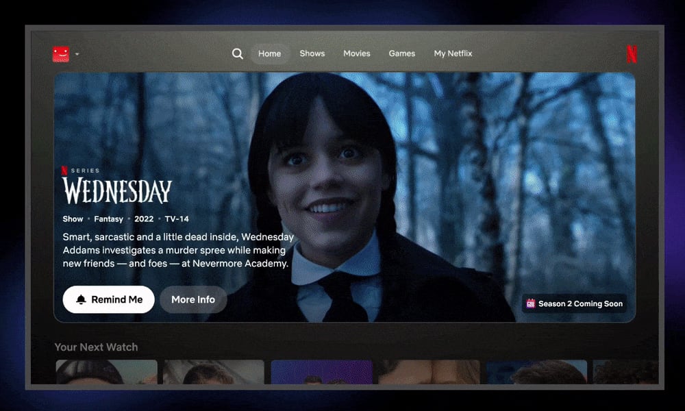
- The Home tab gains a massive banner that suggests something you might want to watch. That could be something you’re in the middle of or a recommendation for a new show based on your viewing history.
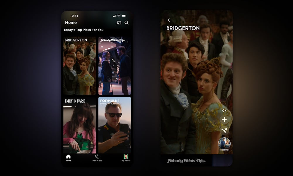
- Below the big, bold banner, you’ll see more categories that include more recommendations, with categories like “Your Next Watch” and “Today’s Top Picks.
- These recommendations will also be more “responsive to your moods and interests in the moment.” It’s unclear precisely what that means, but Netflix execs say it will “pull in more signals” to make its determinations. This could include recent searches and trailers you’ve watched rather than just your broader viewing history. They’ll also factor in the time of day, so if you usually watch upbeat rom-coms in the morning and tear-jerkers in the evenings, Netflix will keep that in mind. Most significantly, they’ll update in real-time, so you’ll see new recommendations right after you give something a thumbs-up or perform a search.
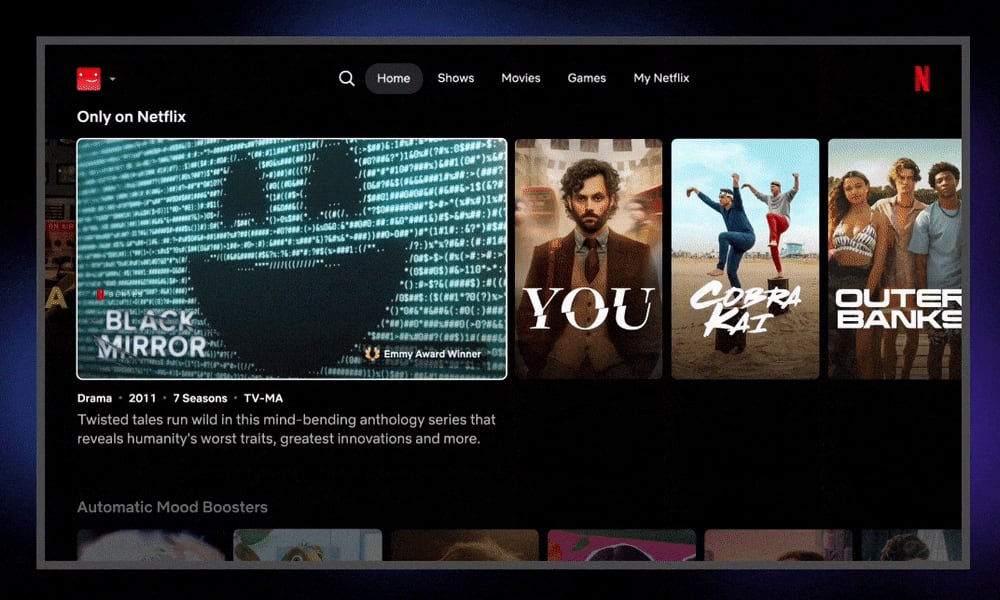
- What’s shown on the Home Screen will come almost entirely from the recommendation engine rather than just pushing generic content at you. Those may still be divided into categories like “Only on Netflix” or “Emmy Award Winners,” but recommendations will be front-and-center in each of those.
- Redesigned tiles for each show are larger and easier to digest. Animations are more fluid as you move through them, and as you hover over each one, it expands to give you more information and some reasons you might want to watch the featured show.
- Shortcuts like Search and My List are being moved to the left-hand side to the top of the page, with a design seemingly inspired by what Apple brought to its TV app on the Apple TV and iPad last year.
- Search will employ Generative AI to let you use natural language and conversational phrases, like “I want something funny and upbeat.” That’s starting as a small opt-in beta on iOS.
- A new vertical “Discovery” feed will provide clips of Netflix shows and movies to make it more fun to find something to watch. You can get a taste of each entry and then decide to tap or click through to watch it right away, share it with friends, or drop it into your “My List.”
Netflix’s goal is to let you spend more time watching shows and less time digging through the user interface to try and find something to watch. The redesign is also necessary in light of its expanded content offerings, like live events and gaming.
The current (soon-to-be legacy) interface was designed for TV shows and movies, and therefore a bit too focused on those categories. “Our redesigned TV home page is simpler, more intuitive and better represents the breadth of entertainment on Netflix today,” Kim said in the press briefing. The new design isn’t quite here yet; Netflix says it’s rolling out in “the coming weeks and months.”


