
Apple Made FaceTime Worse with This One Change in iOS 12
 MichaelJayBerlin / Shutterstock
Toggle Dark Mode
iOS 12 included a plethora of changes and FaceTime was no exception. New AR camera capabilities were introduced (which allow people to replace their faces with custom Memojis; not exactly a monumental change, but a fun one if you ever get bored in the video chat), as well as a more minimalistic layout.
Though, not all of the latest updates went so smoothly.
Group FaceTime, for example, was an exciting new FaceTime capability that promised to allow people to talk to up to 32 other FaceTime users at the same time.
That’s a nice professional upgrade and it’s good for families too, but the feature wasn’t actually ready for the release of iOS 12.
In a rare embarrassing move, Apple had to announce that the promised Group FaceTime would have to be pushed back, and the first beta test of the feature only launched today, so it may be some time before the service rolls out to non-beta testers.
However, the worst issue by far – in our humble opinion – is the new “Flip Camera” command placement.
What’s the Big Issue?
In previous versions of FaceTime, the button to switch the camera (from front to back, or vice-versa, as needed) was clearly located right by the “End Call” red button, or underneath your personal video window. Even as other parts of FaceTime changed over the years, this feature remained more or less intact.
No matter where it was, it was excellent placement; taking less than a second to switch the camera forward or back as needed.
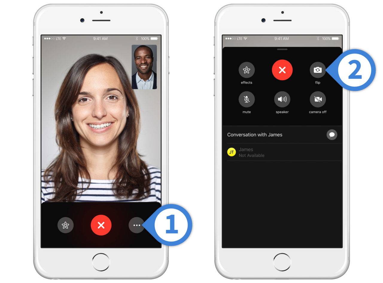
Not so anymore! With iOS 12, the button for flipping your camera has vanished.
To use the function, you have to tap the menu button, find the flip camera icon amongst other various options on a separate window, and select it before heading back. If that sounds incredibly annoying to you, you’re not alone.
Here’s Why the New FaceTime Camera Switch Makes No Sense
- Flipping the camera needs to be instantly available for the average FaceTimer. Think about how you use FaceTime. If you are a normal user who has conversations with SOs, family members, and good friends, then you know that you use the camera switch button all the time. You flip the camera to show off your kids, point out a pet doing something funny, explain a project, share a sunset, demonstrate an activity, display a concert or event, and many other things. It’s a common part of the FaceTime experience. But gating the camera switch behind at least two button presses and a second screen totally ruins that immersive, shared perspective that made the feature so important in the first place.
- It appears to have slowed down the flip function, too. In our tests with the new FaceTime, it certainly feels like there’s a pause before the camera fully switches – it takes much longer than it used to. It’s an additional annoyance on top of everything else. Fortunately, while design elements are less likely to change, a future update of iOS 12 could speed this up, but for now the slowdown is a little depressing.
- The change puts self-promotion ahead of convenience. There’s no real reason to move the button except that Apple wanted a minimalistic interface, while also making it easier for people to use the new Animoji functions. Marketing new layouts and features is fine, but it’s not okay to push away old, most-useful features along the way. Surely this is Design 101, Apple?


