Netflix Is Rebranding

Toggle Dark Mode
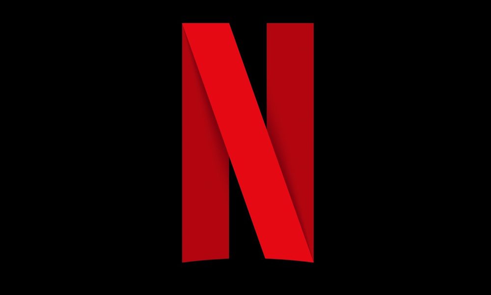
Netflix, the insanely popular video streaming service, recently changed their logo and has already updated their Facebook and Twitter accounts with the new design. There are a few major differences between the old and the new: the new logo features ribbon pattern (resembling a red carpet) and consists of a single letter versus the old logo which spells out the entire word “Netflix.”
Netflix has stated that they plan to feature their new logo on most services such as smartphone apps, social media, and future product integrations. Netflix has also stated that they plan to introduce a new element to their branding, but it’s unclear at this point to what that might be.
This is the second time that Netflix has updated their logo since the company launched in 1997. The first logo change happened in 2014 when the company went from a red background and old typeface to a white background with red lettering. Their first logo truly ages itself, as it was in circulation when the company was mainly known as a DVD rental company. Their newest icon update makes sense as it fits into the typical square avatar or icon format of most apps and social media platforms.


