
Could Apple’s iOS 14 Be Completely Redesigned in Neumorphism Style?
 Mikołaj Gałęziowski
Toggle Dark Mode
For years, Apple’s offered us a semi-flat aesthetic to iOS’ apps and functions that resemble a colorful but straightlaced, forward style. Their aesthetic has played a key element in how Apple has appealed to future users as well as maintain a trusted and enthusiastic populace of customers over the last decade. In doing so, Apple’s design has changed and grown over time in response to the strength of its software, the desires of the market, and the additions of their competitors.
And with that being said, it’s time for a change, and Apple will likely want to update its design language in the coming months. But where did we come from, and what’s next?
The Physicality of iOS 1-6
When the iPhone hit the market, it was a game-changer. Not only did the iPhone have a touch-based screen, but it offered a multitude of functions, full access to the internet, video, and music as well as several other features.
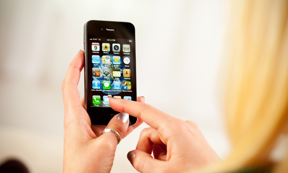
But the visual core of the design was a notion of creating the impression of physicality. Apps and links maintained a noticeable physical presence that gives the visual impression that there was actually a button there, not just a flat design.
With additional updates to iOS came other improvements, whether it be the addition of the App Store, iPad-specific additions, Siri, and more. But it wasn’t until iOS 7 that we saw a massive overhaul of its visual style.
iOS 7-9 – Jony Ive-ing It All
With iOS 7 came a drastic shift in the design. Proposed by Apple designer Jony Ive, the seventh version of iOS was a massive overhaul, where any sense or visual indication of physical buttons were abandoned as everything was flattened. As The Verge puts it; “Gone are the famous glossy icons, the rich textures, and, for the most part, the skeuomorphic apps, replaced by flattened graphics, colorful gradients, and transparencies.” What was likely an attempt to play on a similar level as the visually stimulating Windows 7, it was reviewed as bland and confusing by some critics.
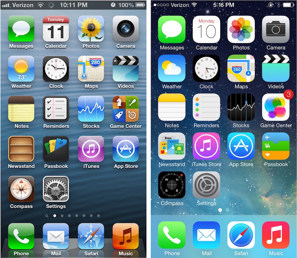
Underlying the flatness of the design were “layers,” where apps and functions would operate over/below one another, whether it was the multitasking functionality of certain apps or the addition of the Control Center functionality. With iOS 8, Apple went out of its way to refine the aesthetic by creating a seethrough keyboard and Notification Center, among other visual enhancements. iOS 9 added additional functionalities to the screen, including screen splitting on iPad and 3D touch capabilities on the iPhone 6s.
iOS 10 and 11 each offered their own visual aesthetic, building, and rebuilding the functionality of Apple’s Messages while also improving the iPhone’s Today View, so it’s easier to control and modify with the press of an Edit button. But Apple didn’t (and won’t) stop there.
iOS 14 – Time to Update to a Neu Model?
Many Apple analysts note the distinct visual contrast between Pre-iOS 7 and post-iOS 7. Most notably, how the move from distinct button shapes and framing to an almost flat architecture for app interactions and how Apple’s shift moved from one to the other without any means of transition. So, what will iOS 14 look like?
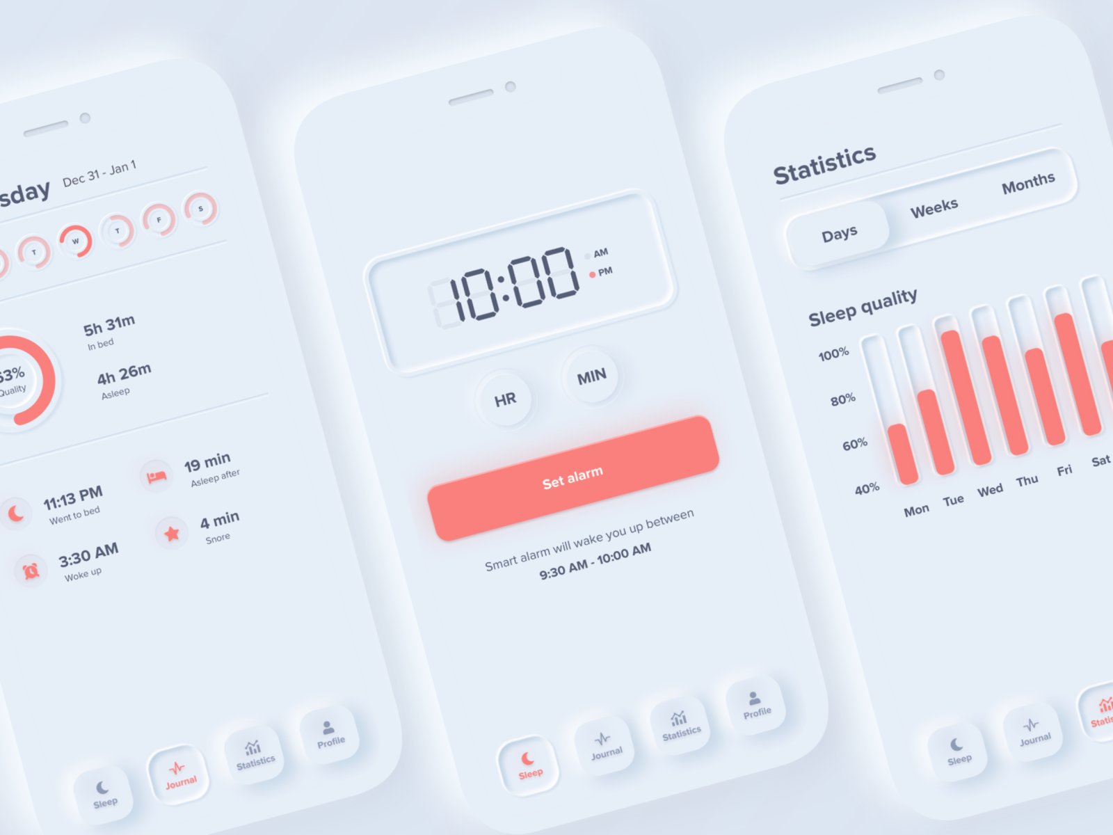
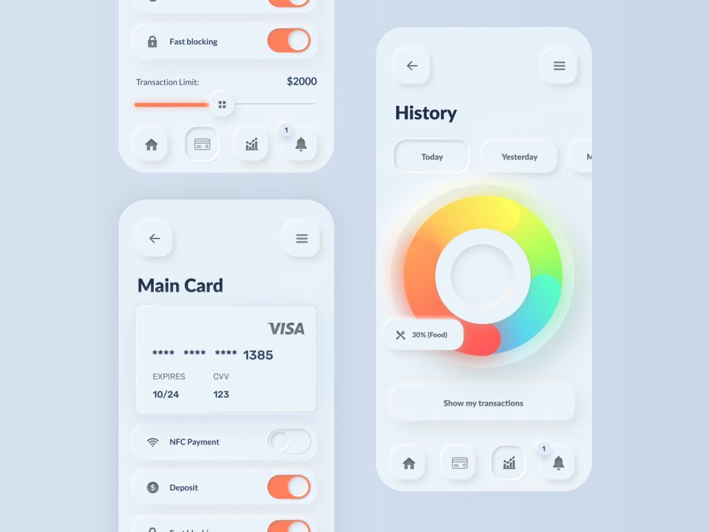
What if there was a better way? A way to blend both styles? This is what some designers are doing with Neumorphism. Neumorphism is an emerging design trend among app creators that sits in the space between flat and a 3D appearance on the screen. It intentionally offers the viewer a flat pane to engage with and access but uses shading and shadows to create the perception of physicality where there is none.
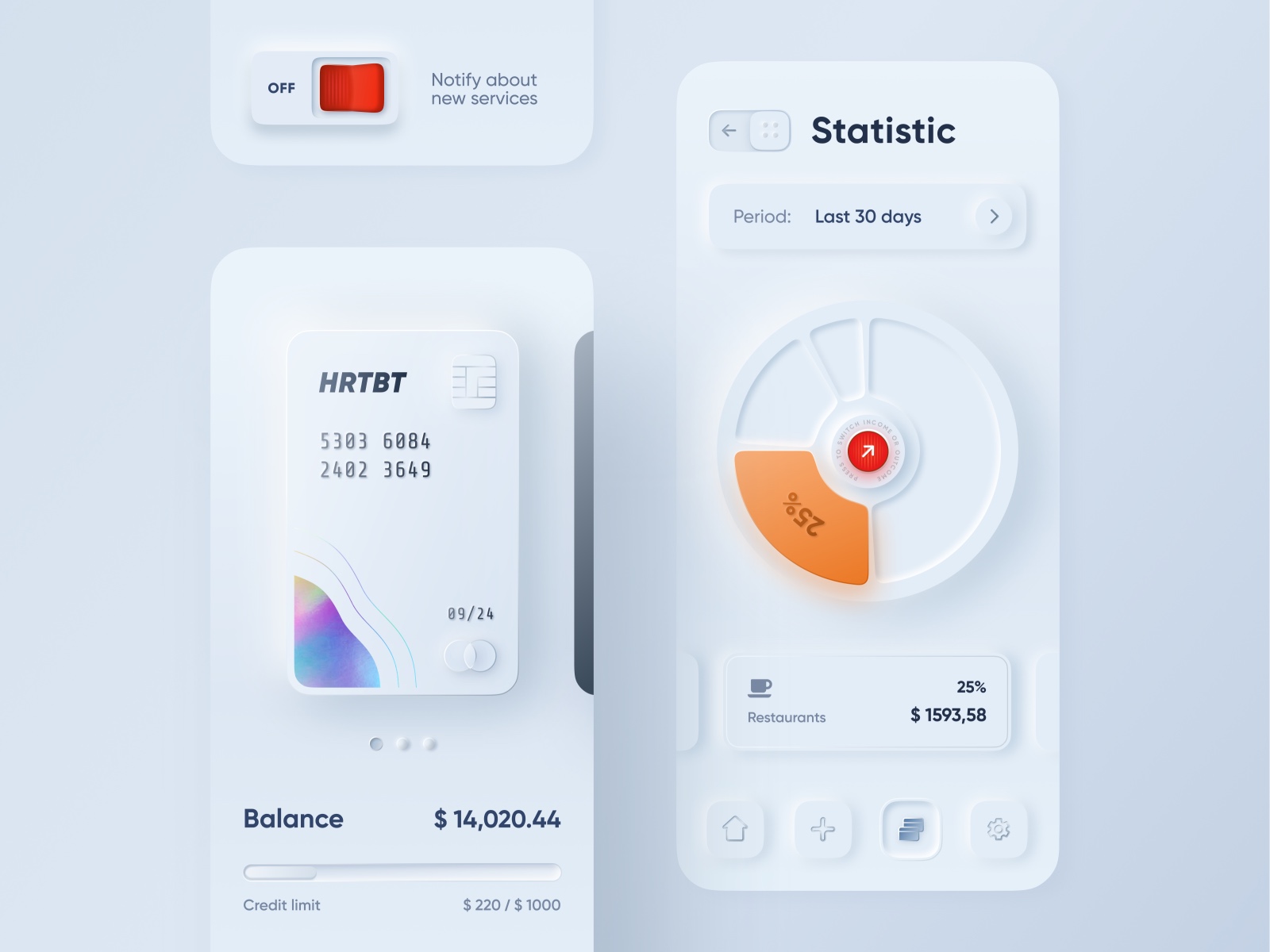
Invented in 2019, Neumorphism offers the user a visual trigger to understand what can be pressed. So if one panel/screen appears more raised than another, then the user would be able to clearly tell what is or is not actionable.
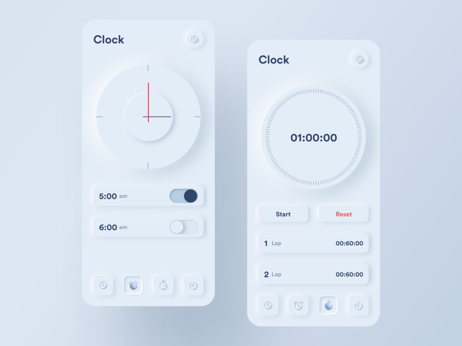
If you’re unsure what this looks like aesthetically, look no further than certain amp simulators or Dribbble’s growing selection of such design aesthetics. A quick scan shows how close these designs often approach actual physical objects, allowing us a more natural opportunity to translate and understand those applications in real-time without “relearning” them.
So will Apple incorporate Neumorphism in the coming years? It’s too early to say. Obviously, this design is only now catching on and is being put through the professional wringer. But it could offer an alternative to the flat aesthetic that clings to Apple’s modern, but aging design.


