
Apple to Refresh Entire Product Lineup with New Font
Toggle Dark Mode
31 years ago Apple introduced the Macintosh Computer to the masses. This computer came preinstalled with an iconic font known as San Francisco, which has been revamped and will be re-introduced this year.

The original San Francisco font, designed by Susan Kare, was a wild typeface. Each of San Francisco’s letters were different. This font resembled that of a classic cut and paste ransom note. Its uniqueness, radically different than the standard fonts found on Windows, became a symbol of Macintosh in the 80’s.
San Francisco has been completely redesigned from the ground up for Apple Watch. Each of San Francisco’s ransom-style letters have been replaced with thinner more modern looking letters. These slim letters feature larger spaces in between them making the font ultimately easier to read.
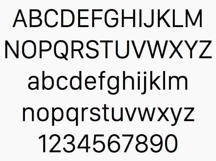
Apple has been criticized in the past for using a Helvetica Neue. It was stated that Helvetica Neue emphasized clean lines over readability and San Francisco is intended to solve this.
Choosing a font design is more complicated than just “readability” and “clean lines.” Jon Hewitt, creative director at design firm Moving Brands, goes on to explain Apple’s choice to switch things up. “[Helvetica Neue] works great in print but doesn’t transfer very well to being used at small sizes on digital screens.” He goes on to say that “we’ve noticed that it’s been designed so it will also look good when it’s used at larger sizes or in print, for example in Apple’s shops.”
Jon Hewitt adds that “fonts have an affect on us subliminally and can set the tone for the text that we read.” Times New Roman can appear to be more formal or even boring in certain contexts. Apple is hopes to avoid looking stale at all costs with a modern and sophisticated typeface that is ultimately more usable.
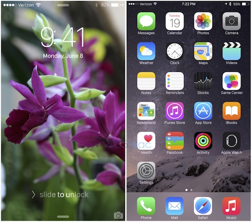
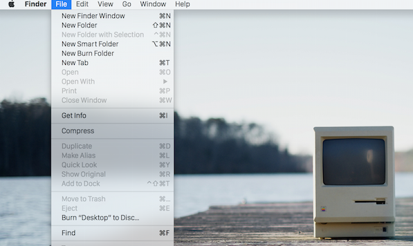
San Francisco will replace Helvetica Neue on all iOS devices and on OS X Yosemite. The new font will give a consistent look and feel among all Apple devices.
9to5Mac explains that installing a new font system-wide isn’t that easy. They report that Apple will have to tweak all of its applications across iOS and OS X to make sure that the new font fits all applications properly. There will be additional quality testing to ensure that the font doesn’t impair usability at different font sizes.
The new 12 inch MacBook is the second device released with an indication of the new San Francisco, as it has San Francisco imprinted on the keyboard. Analysts are saying that San Francisco would look particularly great on Retina Displays, making the new MacBook an optimal choice for the new font.
9to5Mac reports that multiple Apple engineers have stated they aren’t totally pleased with the new typeface. They mention that it may appear to be rough on non-retina screens, such as the one on the MacBook Air. Retina displays are relatively new in the MacBook lineup. Due to the vast amount of non-Retina display laptops on the market, Apple will most likely work out any readability issues on these older displays.
While Apple is most definitely working to create the new cross-platform font, there is a chance that Apple could cancel their plans. Apple has scratched multiple projects in the past including a 4K television set.
Like San Francisco was a symbol of Mac in the 80’s, the newly revamped San Francisco could be a symbol of Mac for 2015 and later. If Apple decides to go through with the San Francisco font revamp, we can expect the new font to be officially announced this June at Apple’s Worldwide Developers conference.


