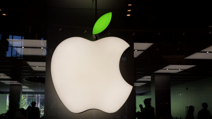
There’s a reason behind the bite in the logo.
What’s with the missing piece? Janoff said the bite is purposeful. “I worked with drawings of a bunch of apples for a couple of weeks, getting an easily recognizable silhouette. From there the bite came out of it, so that it would look like a piece of fruit and not a tomato or cherry.”
The fact that “byte” is also a computer term is what Janoff describes as a “happy accident” — it was something his creative director pointed out during the design process.

