
6 Things You Didn’t Know About Apple’s Iconic Logo
Apple's logo has had a massive influence around the world. The sight of an Apple logo signifies more than just a product. It carries along with it the company's values and mission to "think different." It also signifies creativity, design, and innovation. For such a seemingly small element, it certainly carries a lot of power.
The person responsible for this powerful icon is graphic designer Rob Janoff. He spoke at this year's D&AD Festival, a global creative advertising event, and revealed some interesting facts you might not know about Apple's infamous design choice. Continue reading to learn 6 Things You Didn't Know About Apple's Iconic Logo.
Sir Isaac Newton was on the original Apple logo.
Designed by Ronald Wayne, one of the original co-founders of Apple, the original logo was more of an illustration. It depicted Newton sitting under a tree — the spot that helped him introduce the concept of gravity. Newton's findings had a massive influence on the world of science, similar to Apple's impact on the world of personal computing.
Steve Jobs knew that this intricate logo wouldn't work for the company because of two things: the logo needed to be replicated to fit on smaller devices, and it also had to incorporate the company name without directly stating it. That's when he contacted marketing firm Regis McKenna, who put graphic designer Rob Janoff on the project.
There was only one logo design.

Typically there would be an extended design process in place for something so important as a rising tech company's branding. There would be multiple design options to choose from — but with Apple, there was only one choice.
"I think a lot of it was the naivety and inexperience of both Steve and I at the time," shared Janoff. "I always have more than one design now."
There's a reason behind the bite in the logo.
What's with the missing piece? Janoff said the bite is purposeful. "I worked with drawings of a bunch of apples for a couple of weeks, getting an easily recognizable silhouette. From there the bite came out of it, so that it would look like a piece of fruit and not a tomato or cherry."
The fact that "byte" is also a computer term is what Janoff describes as a "happy accident" — it was something his creative director pointed out during the design process.
The rainbow color scheme was intentional.
Apple wanted to prove that its technology was a game-changer in the world of computers. To do this, it highlighted one of its main differentiators: color. At the time, no other computer was working with colors.
Apple decided to incorporate colors into the logo to keep the brand synchronized with its tech offering. It updated the logo to a monochrome design in 1998 given that color monitors were no longer a competing factor in the industry.
It cost upwards of $50,000.
Janoff's iteration of the logo was created with archaic tools. Yet Apple wanted to stay ahead of their competitors — and to do this, Jobs insisted on digitizing the logo. The cost? A whopping fifty grand.
But it wasn't for nothing — it helped to modernize the brand. "It not only brought it up to date, but you were able to get beautiful, dense colors that sparkle because they were made out of pixels," said Janoff.
The new logo first appeared on the Apple II computer model.
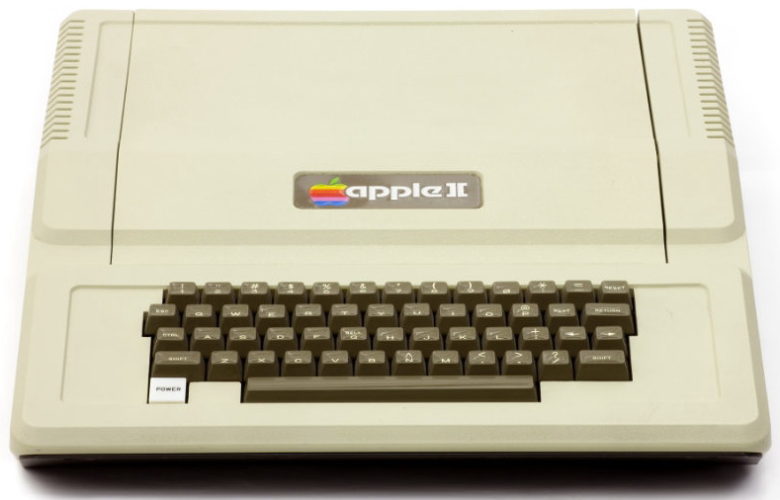
Apple had a booth at the West Coast Computer Faire, a computer industry conference and exposition. It wanted to debut the Apple II but also wanted to show off its new professional logo. By showing off its new branding and an innovative product, they were able to cause a stir at the event.
Even though Janoff was responsible for the branding, he never actually got to use the computer. He was only provided with a fiberglass prototype of the Apple II computer (created by Jobs) from which to work.
Whether Janoff knew it at the time or not, he created something that would forever change the company's image. He still smiles when he sees Apple logos plastered across phones, tablets, and laptops. "The key, I think, to effective, memorable designs, is keeping it very simple so somebody can remember you," Janoff shared.