
Make Your iPhone Easier to Read with ‘Display Accommodations’
 wccftech
Toggle Dark Mode
iOS is among the most advanced and universally accessible software platforms in the world. Whether you’re looking to enlarge the size of the font to make it easier to read, use assistive touch settings to help navigate your device, or enable accommodations for a variety of other disabilities, Apple brings more and more features to iOS with each successive update that are designed to help anyone and everyone get the most out of their devices — and even improve the quality of their lives in the process.
While we’ve previously covered how to use a wide range of Accessibility features on iPhone and iPad, however, Apple in recent years has baked even more of them into the iOS platform — most of which are designed to help users reduce eyestrain, while allowing the customization of their device’s display. Here we will examine the three main Display Accommodation settings and how you can use them to your advantage.
How to Get Started
- Grab your iPhone or iPad and open the iOS Settings app.
- Scroll down and tap General.
- Tap Accessibility.
- Finally, within the Vision group of sub-options, tap Display Accommodations.
From there, you’ll see the following three settings:
1. Smart Invert Colors

By toggling the first Invert Colors setting on, you’ll instantly notice colors on your display shift to their opposite (inverted) color as it appears on the broader color spectrum. For example, Whites become Blacks (and vice versa), Blues become Orange, and Greens become Reds and Pinks.
This setting, while intended for someone with low vision to more thoroughly discern onscreen content, resembles that of the long-overdue iOS ‘Dark Mode’ feature we were hoping to see back in iOS 10 — and again, in iOS 11 — but to no avail. The color inversion becomes a bit awkward when you start branching out into other content beyond menus, Messages, and Mail, for example; but the feature is still a viable workaround for those who want to emulate dark mode on their devices — at least until Apple makes good on its delivery of a true ‘Dark Mode’. Learn more about Smart Invert here.
2. Color Filters
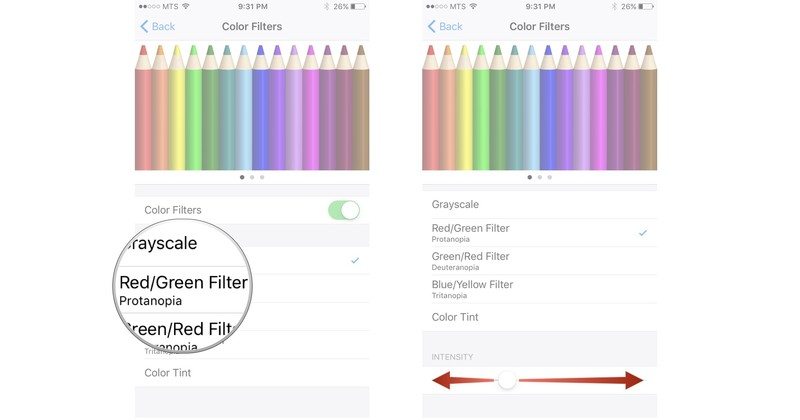
The next option down is Color Filters, and tapping on it will reveal a Color Filters toggle underneath a dazzling array of colored pencils. By toggling the switch to ON, you’ll be presented with yet another array of sub-menus. These options include applying various screen filters, which are designed to reduce eyestrain, or enhance visibility for those with colorblindness, by filtering and/or emboldening certain colors from the 16 million iPhone is inherently capable of reproducing.
The first option, Grayscale, will completely eliminate all traces of ‘color’ — replacing them with varying shades of Whites, Grays, and Blacks.
The next three options — ‘Protanopia’, ‘Deuteranopia’, and ‘Tritanopia’ — are Red/Green, Green/Red, and Blue/Yellow filters, respectively, and each has a variable affect on the saturation of those colors as they appear onscreen.
By selecting Color Tint (the last option in the filters menu), you’ll gain almost total control of manipulating the hue and intensity with which it saturates your display. You can play around with these meters for a bit to better determine the best color and intensity for you — but the hue options are synonymous with the colors of the rainbow (Red, Orange, Yellow, Green, Blue, Purple, etc.), and will shift accordingly as you move the Intensity and Hue meters.
3. Reduce White Point
Heading back to the previous menu, you’ll notice that the last option (Reduce White Point) is also a toggle switch like Invert Colors. By flipping it on, you’ll be able to substantially reduce the display’s brightness — even beyond the level achievable by Apple’s standard brightness meter in the iOS Control Center. Once you toggle Reduce White Point on, you’ll then be able to decide how intense you want the brightness of your display to be by shifting the meter that appears directly below it.
It’s a great feature for those who really can’t stand the piercing white glare of their iPhone’s display — and while iOS 10 and 11 also boast the Nightshift feature Apple introduced in iOS 9.3 of last year, Reduce White Point is nevertheless a great option to help minimize or eliminate eyestrain — especially for those who like to read on their device for extended periods of time.


