Making Waves: Apple Music’s New Identity Is Literally Built by Sound
Toggle Dark Mode
While the new Apple Music app icon in iOS 27.2 has been a bit polarizing, eschewing the warm and inviting red gradient for a starker black-and-white aesthetic, it seems that suspicions about this being part of a bigger plan were in fact accurate.
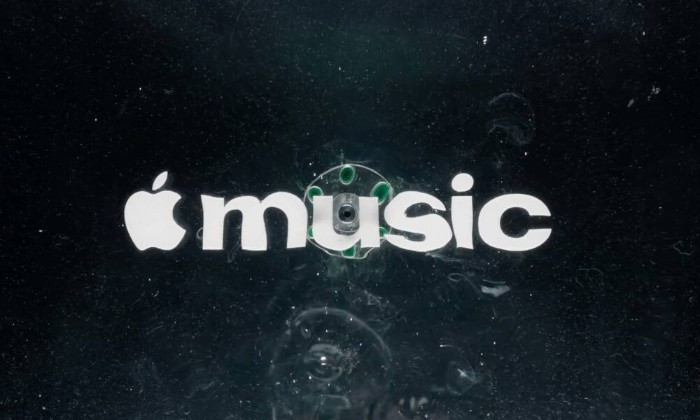
This morning, Apple officially announced a rebrand of Apple Music on YouTube and X, sharing how sound “brought the Apple Music logo to life.”

To be clear, this isn’t referring to the new app icon, but rather the official wordmark logo that first appeared with the opening of London’s Apple Music Hall last month. While some assumed that might have been exclusive to the new venue, most took it as the first sign of an impending rebrand. Apple’s just been quiet about it until now.
The new logo was created in collaboration with British producer Fred Again and Nest Acoustics, as Apple outlines in a 79-second YouTube video:
For the rebrand of Apple Music, we wanted sound to create the visuals. How do we take this idea of music and distill it into something visually beautiful? Essentially the idea was to create the perfect sound wave.
As the video demonstrates, Apple placed an Apple logo and the word “music” below a tank of mineral oil and then played sound through the liquid to make it oscillate at the frequency of the notes, creating a liquid-inspired look.
This latest move is similar to last year’s Apple TV rebrand, which also came as a second stage in early November, after Apple first dropped the plus on October 13 (coincidentally a year to the day before Apple unveiled this year’s fourth-generation Apple TV 4K).
According to Wallpaper, we can “expect to see [the new logo] roll out across all platforms this week,” suggesting that Apple may sneak it into a new RC build before iOS 27.2 and the rest of the gang get their final public release. Alternatively, it may simply be a change the company can push out from the backend.
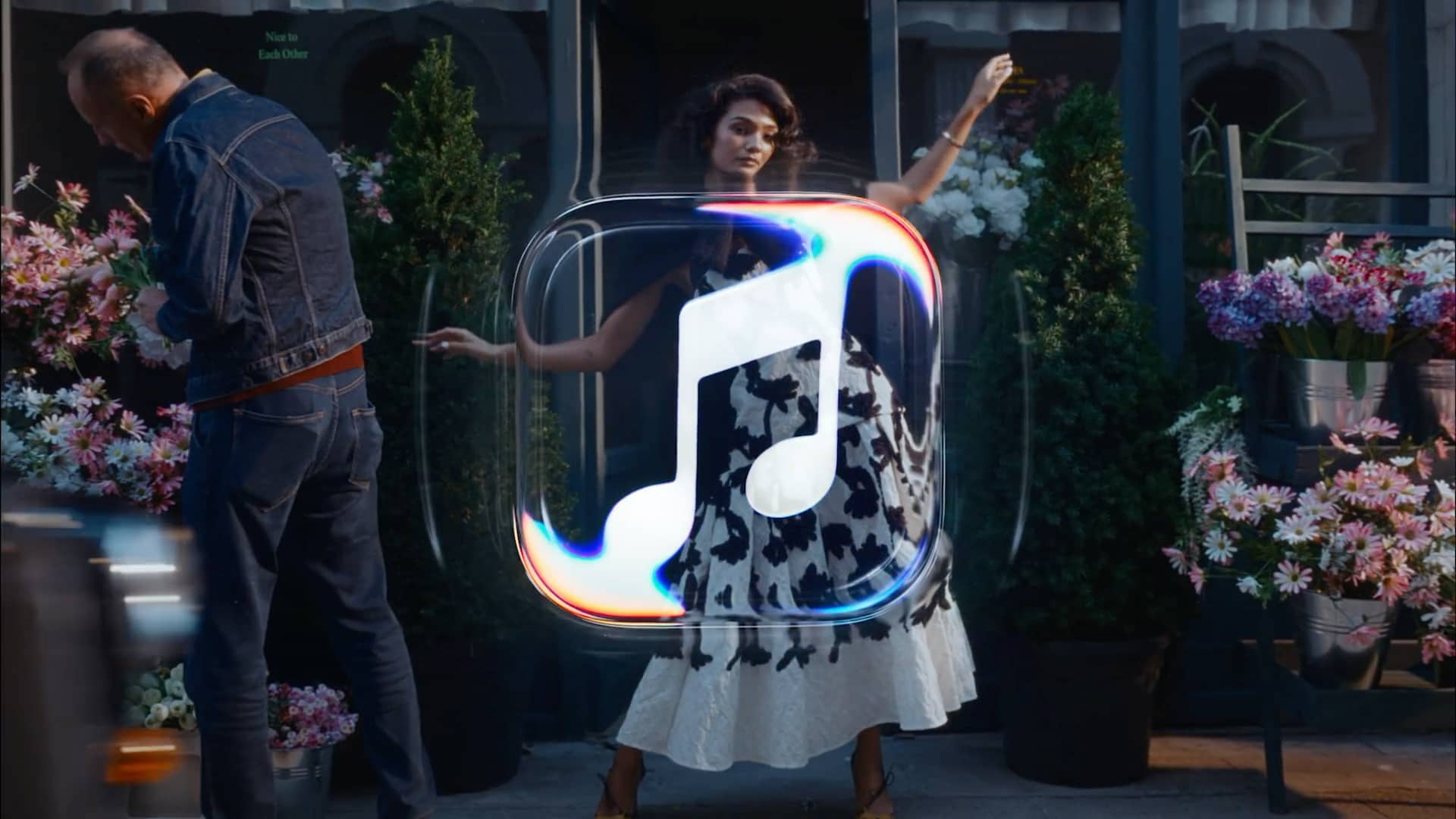
This raises some hope that the black-and-white Music app logo may simply be a placeholder, but that could honestly go either way. After all, Apple didn’t simply remove the color; it also redesigned the beamed pair of eighth notes slightly, suggesting that this was an intentionally crafted icon, not just a monochrome treatment for the existing one.

On the flip side, the video also clearly shows Apple doing the same with the icon, and it’s pretty hard to believe that a black-and-white image is all it came up with after that exercise.
The Apple Music wordmark logo also bears little resemblance to the app icon, and that’s nothing new as the old icon wasn’t exactly representative of the old Apple Music logo either. Still, Apple went in the opposite direction with the TV app icon, trading the basic white-on-black version for something with more of a gradient, so we’ll have to wait and see if it at least tweaks the Music icon in some way.