
macOS Tahoe Doesn’t Like Oddly Shaped App Icons (But You Can Get Them Back)

Toggle Dark Mode
While all of Apple’s operating systems are getting a major redesign this year, the new Liquid Glass is still very much a work in progress. We already saw Apple correct some missteps in iOS 26 with the second beta earlier this week, but it’s also done something weird with icons in macOS Tahoe to make them fit into the new motif.
We’re not just talking about the Finder icon, which has plenty of detractors — and for good reason. That change seems symptomatic of a larger problem: Apple’s insistence on taking the whimsy entirely out of Mac app icons by forcing them to conform to iOS-style squircles.

This is seemingly the same logic that forced it to put an unsightly border around the classic Finder icon, and while it changed that ever-so-slightly for the better in the second macOS 26 beta, it remains a shadow of its former self.
This change is most noticeable with many third-party app icons. Apple has already redesigned most (but not all) of its first-party app icons to conform to the new design. However, third-party apps that don’t adhere to Apple’s idea of a perfectly proportioned icon can instead look forward to being rendered in a glass box.
When I installed the macOS Tahoe 26 developer beta, I was immediately confronted by a half-dozen icons in my dock that all looked weird for no immediately discernible reason. This included Cultured Code’s Things, Bare Bones’ BBEdit, Google Chrome, and even Pixelmator Pro.
That last one is slightly ironic, considering Apple now owns Pixelmator. However, Apple hasn’t transitioned all its own app icons to the new designs either. Script Editor is the most notable built-in app with this problem, but Final Cut and GarageBand also suffer from the forced “squircling” treatment.
On closer examination, it was apparent that the issue comes down to app icons that aren’t already proportioned into squares. Things looks squarish, but it’s actually more rectangular. Others, like Pixelmator and Script Editor, are more obviously irregular, as they have elements like pens that extend beyond the borders of the icon.
Of course, that design element is part of the fun of Apple’s desktop operating system that goes back decades. Sadly, while Apple insists it wants to keep iPadOS and macOS separate, its move to unify everything under the Liquid Glass banner appears to be eliminating some of that playfulness on the part of app developers.
Apple has already moved to a more boring aesthetic for many of its app icons to fit into the new design. Preview has gone from a loupe offset over a nice seascape image to centering it on a bland blue gradient background, TextEdit has lost the pen, and Image Capture looks nothing like its former self. Granted, it’s arguable whether a digital camera still belongs in that one, but the new version looks more like a movie editing app. Automator and Disk Utility have also lost much of their former magic.
Meanwhile, everything else that fails to conform to Apple’s new squircle specs gets forced into a glass frame, resulting in shrunken-down icons that look downright weird.
This remains unchanged in the second beta of macOS Tahoe, so it seems that this is a deliberate choice to force developers to update their icons to the new specs.
How to Get the Original App Icons Back
There’s still hope Apple could revert this or find a better way to handle these app icons. However, the good news is that macOS Tahoe doesn’t seem to (yet) override any icons you set yourself, which means you can easily get your apps looking like they’re meant to without much fuss.
The trick is to assign a new icon to the affected apps in the same way this has been done for years. Once you put an icon of your own onto the app, it gets respected as the primary icon, at least in the Dock and Finder. You’ll still have to deal with the “squirclified” version in other places where the app appears, such as in the System Settings, Share Sheets, and Shortcuts, but thankfully you don’t need to look at those nearly as often.
For those who aren’t familiar with the process, you’ve nearly always been able to assign any icon to any app (or other file, for that matter) by opening the information window for it and dragging a new icon on top of the old one. You can use any icon you want — it doesn’t have to be in any way related to the original. So, if you wanted your Mail app to look like a bird, you can certainly do that.
However, each app has its proper icon tucked away in a file within the app’s package, so you don’t have to look far if you just want to restore the pre-Tahoe appearance. Here’s a step-by-step guide on how to do this:
- Open Finder on your Mac.
- Open the Applications folder.
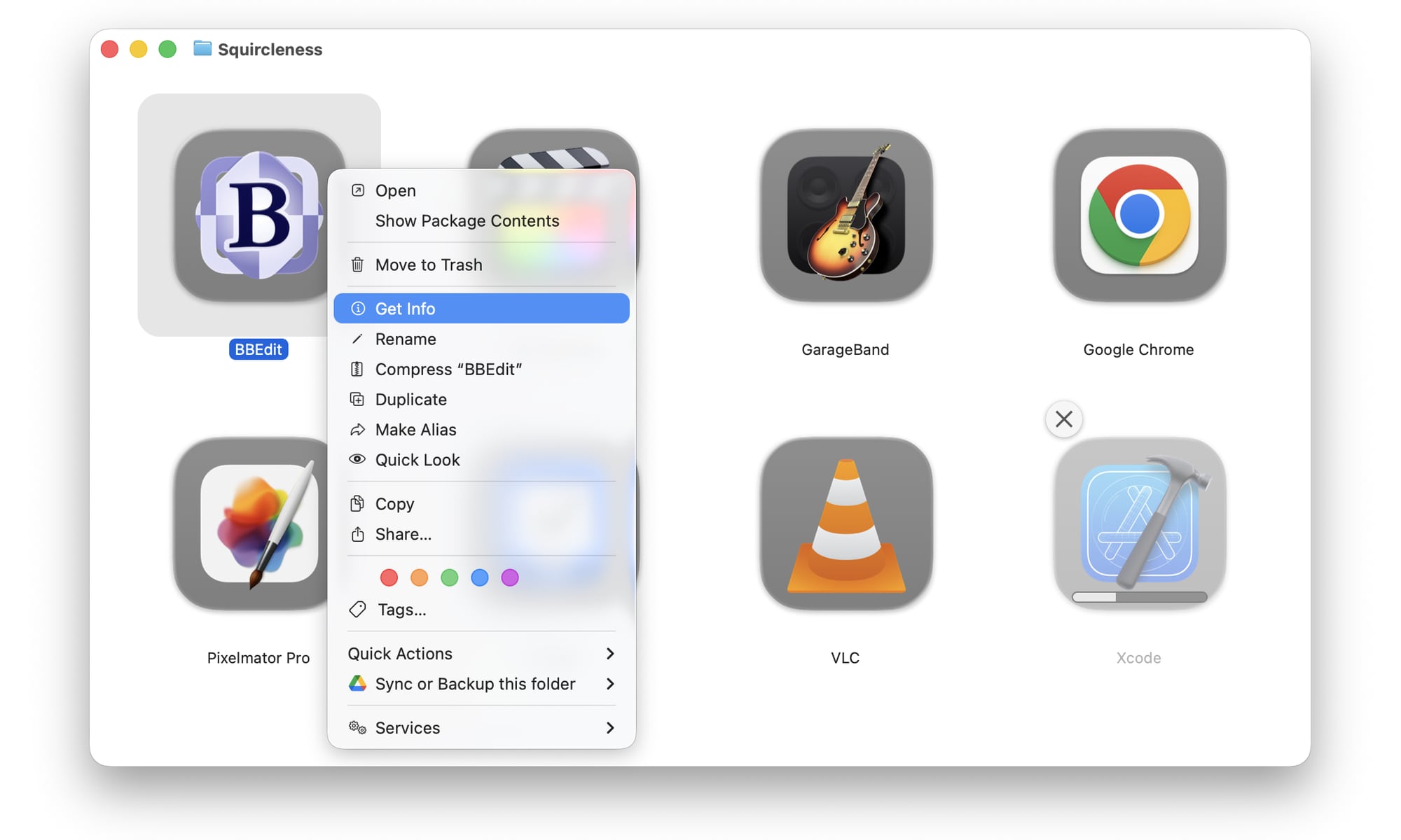
- Find the application you want to change the icon for and right-click on it.
- Select Get Info from the context menu that appears.
- This will open an info panel for the app. Drag it out of the way of the original app icon if necessary.
- Right-click on the icon again and choose Show Package Contents. This opens a new Finder window showing the files and folders within the app’s package.
- Navigate to Contents > Resources.
- Locate the application’s icon in this folder. It will typically have an “icns” extension.
- Click and drag the icon file to the app’s info window that you opened in steps 4 & 5 and drop it on top of the small icon in the top-left corner, beside the app’s name.
- If prompted, enter your password to authorize the update to the app’s icon.
- Close the Info and extra Finder windows.
The new icon should appear immediately in the Finder Applications folder. If you have the icon in your Dock, you’ll need to close and relaunch it before the icon updates there.
We’re still in the early stages of the macOS Tahoe beta cycle, so it’s possible Apple might fix this in later betas. However, if the squircles are still appearing when the public betas or final release comes out, the above steps should still work as it’s unlikely Apple will remove the the ability to change icons for files and apps — although it’s also possible it might force any manual changes into the new style. We’ll have to wait and see what happens.
In the longer-term, the greater risk is that other developers will follow Apple’s lead here and start watering down their icons to conform the Liquid Glass.


