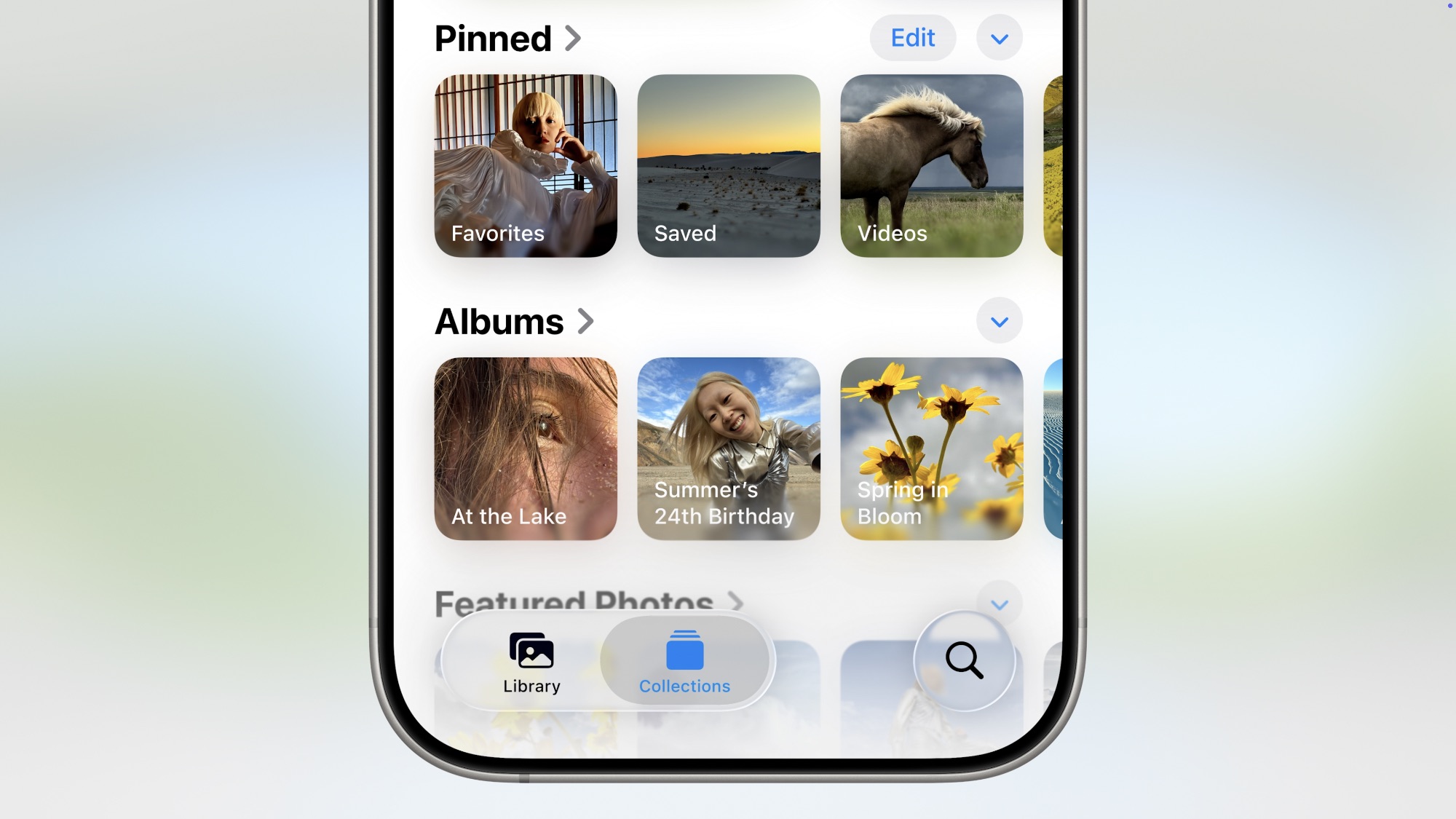
Photos Returns to a Tabbed Layout

This year’s iOS 26 release ushered in the biggest system-wide redesign we’ve seen in 12 years, but it seems that Apple decided to get a head start last year when it overhauled its Photos app.
The iOS 18 Photos app eliminated the distinct tabs we’d seen for years (and the tab bar at the bottom) in favor of a single view. The timeline flowed down into a “Collections” view of albums, featured photos, and more.
Many people weren’t fans of this change, and it wasn’t just because Apple made the Photos app less familiar. It took a fair bit of tweaking to keep the view from being overwhelming, and Apple also went too far in certain aspects of the design and ended up having to dial things back. For instance, the early iOS 18 betas had a confusing “Carousel” view that thankfully never saw the light of day beyond the beta cycle; Apple pulled it from the fifth iOS 18.0 beta in August 2024. Another annoying design change that awkwardly zoomed photos and videos was fixed later in iOS 18.2.
Now, Apple has reversed course on another controversial aspect of the iOS 18 Photos design: the collections view below the timeline. This was a feature that many folks learned to live with, but we don’t imagine too many people were actually fans of it. With the shift to Liquid Glass in iOS 26, Library and Collections have now been properly separated into two distinct sections, so you’ll no longer need to worry about scrolling past the bottom of your timeline and getting lost in a bunch of other stuff.
