
Apple and Typography
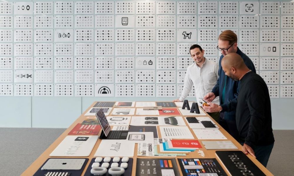
In this image, you’re looking at Dye and two graphic designers as they discuss the development of the San Fransisco typefaces — the neo-grotesque typeface that first came to the Apple Watch in 2014 and subsequently to iOS 9 and OS X.
The typeface has a big job to do on such a small screen. But SF is more than just a font; it is capable of working across 150 languages and can form into variants like the 3D version used for Apple Pay.
After many years of seeing how rapidly personal computers were advancing regarding display graphics and text, Apple has always had to adapt and will continue to as technology advances.