
A Better Control Center
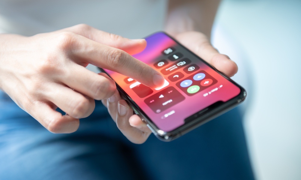
The iPhone’s control center is already great. You can access a bunch of useful features just by swiping up from the bottom of your iPhone (or down from the top-right, depending on the model). Android’s version is not as well-designed, but it does offer more features than the iPhone.
By swiping down on an Android device, you’ll get two pages worth of shortcuts and functions. Granted, not every feature there is useful, but you can rearrange where they are, so you only have the essential things on the first page. And the best part is, you can even go to your settings app from there.
And there are some features I hardly use, that I would like to move to the back, so I can move better tools up to the front. Not only that, but I’d love to go to my settings without having to go to the Home screen and look for my Settings app.