
Lots of New Information
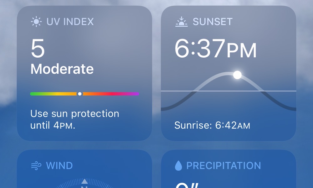
The main screen layout has also been significantly improved to show more information than ever before. The 10-day forecast includes coloured lines to indicate high and low-temperature ranges, along with other details like the percentage chance of rain. Scrolling down further, will give you an Air Quality index, weather map, and new square widget-like cards presenting UV Index, Sunrise/Sunset, Wind, Rainfall, Feels Like, Humidity, Visibility, and Pressure, in a far more attractive and readable layout. Cards for things like Wind and Pressure show appropriate diagrams, while others provide additional information, such as why the Feels Like temperature is what it is.